Table of Contents >> Show >> Hide
- Quick primer: what is Dark Mages?
- Why the illustrations matter more than “looking cool”
- The art “zones” that shine in Dark Mages
- What “great” looks like: four illustration strengths Dark Mages leans into
- Expansion art: new categories, new visual challenges
- Alternate character art: the Female Character Set
- How to enjoy the illustrations like a tiny museum curator
- Are the illustrations actually “that good”? What fans and reviewers point to
- of experiences: what it feels like to play (and admire) Dark Mages art
- Conclusion
Some card games win you over with crunchy combos. Others do it with lore so dramatic you can practically hear a choir the moment someone draws a “definitely-not-cursed” scroll. Dark Mages pulls off a neat trick: it’s a fast fantasy duel that also doubles as a tiny art gallery you can shuffle.
If you’ve ever caught yourself “accidentally” taking two extra seconds to admire a card before playing it (purely for strategic reasons, of course), this one’s for you. Below, we’ll dig into what makes the illustrations in Dark Mages so satisfyinghow they support the world of Thärin and Northland, how they help you parse the game state at a glance, and which parts of the deck tend to produce those “okay wow” moments.
Quick primer: what is Dark Mages?
Dark Mages is a fantasy card game for 2–8 players, typically running 20–60 minutes, where you play as one of eight magicians battling to become the legendary mage of Northland on the plains of Thärin. Gameplay blends card play with dice-driven, RPG-flavored combat beatsso the art has a big job: it has to sell the fantasy and stay readable under pressure.
Depending on the edition, the box includes a substantial deck plus character cards, and even polyhedral dice (the classic tabletop “math rocks” lineup) with a pouchan immediate signal that the game wants to feel like a tabletop adventure as much as a card duel.
Why the illustrations matter more than “looking cool”
In a fantasy duel game, illustration isn’t just decorationit’s user experience. The best card art does three things at once: it builds a believable world, it communicates tone (grim, heroic, weird, humorous), and it stays legible when your friend across the table is doing that thing where they lean in and squint like a detective in a noir film.
1) Art direction creates a world you can recognize instantly
Dark Mages leans into classic dark-fantasy ingredientsmysterious sorcery, ominous artifacts, creatures that look like they have strong opinions about trespassers, and landscapes that practically whisper, “This was a bad shortcut.” The key is consistency: a shared visual language across character portraits, spells, and items helps the deck feel cohesive, not like a random stack of fantasy postcards.
2) Strong silhouettes help you “read” the card before you read the text
Great card illustrations have shape clarity: a mage’s stance, an item’s outline, an enemy’s posture. That clarity is more than aestheticyour brain recognizes a spear-like object, a swirling aura, or a looming creature faster than it reads rules text. It’s one reason the cards can feel quick and punchy even when the table gets busy.
3) The illustrations sell mechanics that feel tabletop, not abstract
Because Dark Mages mixes card play with dice-driven combat, the art often carries the “impact” that numbers alone can’t. A spell doesn’t just say it hurtsyou see it hurt. A hex doesn’t just debuffyou feel the malice baked into the visuals. That turns mechanical moments into story beats.
The art “zones” that shine in Dark Mages
The deck structure encourages different types of illustration. Think of it like a fantasy film: characters are your actors, spells are your special effects, items are your props, and enemies are your “please don’t split up” warnings. Each category asks the artist to solve a different visual problem.
Character cards: portraits that imply a playstyle
A strong character illustration does more than show a wizard holding a staff (bonus points if it’s taller than they are). It implies how that mage fights: are they controlled and precise, or chaotic and barely in charge of their own lightning? Are they armored and stoic, or robed and unsettlingly calm?
You can often sense a character’s “kit” from art cues alonerunes on the sleeves hinting at arcane mastery, talismans suggesting item synergy, or a background full of storm clouds that screams, “I brought weather, and you’re not going to like it.”
Spells: controlled chaos with readable focal points
Spell art is where fantasy illustration can go off the rails in the best way. The trick is controlled chaos: energy, smoke, sparks, or shadowbalanced by a clear focal point so the card doesn’t become an abstract painting titled “Wizard Tax Audit (Unpaid)”.
In the strongest Dark Mages spell illustrations, the composition usually guides your eye: the caster (or the spell source) leads to the impact point, with effects framing the action instead of burying it. That makes spells feel powerful while staying visually understandable at a glance.
Magic items: “artifact design” you can almost feel
Item illustrations tend to land hardest when they feel physical. Texture matters: worn metal, cracked gems, leather straps, engraved runes. When an item looks like it has weight and history, it becomes believable that it can change a duel.
Good artifact art also uses negative space wiselyitems are often centered and cleanly framed so the object reads instantly. That’s especially important in play, where players need to track what’s equipped without a microscope.
Hexes and scrolls: visuals that communicate “good luck with that”
Hex cards (and scroll-themed effects) have a delicious job: make the player feel slightly cursed just by holding the card. The best illustrations lean into symbolismtwisting sigils, corrupted light, unnatural geometrywithout becoming so busy that you can’t parse the image.
Scroll imagery, when done well, also conveys knowledge as danger: the idea that information can be a weapon. You’re not just reading wordsyou’re unlocking a consequence.
Creatures and enemies: threat design with personality
One of the most fun parts of fantasy card art is creature design. The illustrations that stick tend to balance fear and distinctiveness: a monster can be horrifying, but if it’s also visually uniquestrange anatomy, an eerie expression, or an unexpected silhouetteit becomes memorable rather than generic.
In a duel game, enemies function like pressure. Great enemy art does something subtle: it communicates urgency. You look at the card and think, “I should deal with that,” even before the rules text confirms it.
What “great” looks like: four illustration strengths Dark Mages leans into
1) Cinematic lighting that highlights the action
Many standout fantasy illustrations use lighting like a director uses a spotlight. Bright spell glow against dark backgrounds, rim light around a mage’s cloak, or a single strong highlight on an artifactthese choices create drama and make the card readable.
2) Color palettes that separate categories and moods
Even when you can’t name the palette, you feel it: cold blues for arcane precision, sickly greens for corruption, ember oranges for destruction. When a game’s art maintains a consistent approach to color and mood, the deck feels coherent. It also helps players intuit what kind of effect a card might represent.
3) “Story hints” baked into backgrounds
The best card art rewards attention. Background detailsruins on the horizon, symbols etched into stone, a distant figure watchingcreate micro-stories. These touches don’t slow the game down; they enrich it between turns and make the world feel larger than the table.
4) Tasteful restraint: not every card has to scream
High-energy spell art is great, but variety is better. Quiet illustrationsitems resting on an altar, a mage in a calm stance, a scroll unfurlingcreate pacing. That pacing makes the explosive cards feel even more explosive when they show up.
Expansion art: new categories, new visual challenges
Dark Mages: The Arcane Order expansion adds new cards and introduces new types of challenges like changing weather conditions, traps, and enemies you may need to face togethermeaning the illustration burden expands too. Weather, in particular, is tricky to illustrate: it has to feel impactful without looking like “cloud stock photo, but make it fantasy.”
The best weather and trap illustrations tend to use environmental storytellingvisibility reduced by fog, jagged ice framing the scene, or a suspiciously inviting corridor that screams “trap” even if your party insists it’s fine. In other words: the art becomes a warning label.
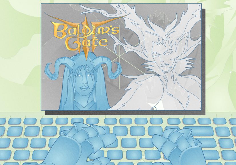
Alternate character art: the Female Character Set
If you’re here specifically for illustration appreciation, it’s worth noting there’s a female character set that offers female versions of the base game’s male character cards. From an art perspective, alternate character sets are a treat: you get to see how the same role, identity, or “class vibe” can be expressed through new portrait decisionspose, costume design, facial expression, and even palette tweaks.
Done well, alternate character art isn’t just a cosmetic swapit’s a fresh angle on the same archetype. For collectors and art fans, it’s basically an official “variant cover” moment.
How to enjoy the illustrations like a tiny museum curator
Do a “category flip”
Instead of shuffling everything, sort cards by type (characters, items, spells, hex/scroll effects, enemies). You’ll notice visual patterns faster: repeated motifs, signature lighting choices, and how the art direction keeps categories distinct.
Pick one card and analyze it for 60 seconds
Look at composition (where your eye goes first), value contrast (light vs. dark), and storytelling details (what’s happening beyond the focal point). You’ll start noticing why certain cards feel “premium,” even if the print size is small.
Make a “favorite five” and explain them to someone
This is the fastest way to find what you personally love: monster design, moody landscapes, ornate props, or big spell energy. Plus, it’s fun to justify your taste like you’re on a fantasy art jury: “Yes, I chose this card for its strong negative space and emotionally unstable lightning.”
Are the illustrations actually “that good”? What fans and reviewers point to
One of the most repeated compliments from people who talk about Dark Mages is that the artwork is a standout drawoften mentioned right alongside comparisons to big-name fantasy card games. That’s not a small compliment in a genre where card art is basically a competitive sport. The general point is consistent: the cards are simply enjoyable to look at, and that enjoyment carries through repeated plays.
It also helps that the game’s presentation fits its tabletop identity. When a card game includes polyhedral dice and leans into RPG flavor, the art has to match that “adventure module” feeling. Dark Mages does: the illustrations make the deck feel like a traveling spellbook you’re constantly opening.
of experiences: what it feels like to play (and admire) Dark Mages art
The first time Dark Mages hits the table, there’s usually a moment where the game pauses for the least tactical reason imaginable: someone starts fanning the cards like they’re judging a fantasy art contest. You’ll hear little reactions“Whoa,” “This one’s nasty,” “Okay, I want that staff,”and that’s the point. The art creates micro-beats of delight before the duel even begins.
In my favorite kinds of sessions, the illustrations become a shared language. A player doesn’t say, “I’m worried about your equipment synergy.” They say, “I’m worried because you’ve got the card with the cursed-looking blade and the ‘I’ve seen things’ lighting.” Another player might nickname a character based on the portrait alone“Storm Grandpa,” “Library Menace,” “Potion Gremlin Energy”and suddenly the table is half strategy, half affectionate commentary.
There’s also a special joy in how the art changes the emotional temperature of the game. When you draw a calm, elegant item illustration, it feels like a breath. When you flip a spell with aggressive contrast and explosive effects, the table leans in. People react to the image before the mechanics, which is exactly what strong card art should do: make the game feel like something is happening, not just that numbers are moving.
Over time, you start developing favorites that have nothing to do with winning. You might keep a “top shelf” pile: the cards you’d frame if you could. You’ll notice patterns in your tastemaybe you love the moody, high-contrast pieces, or maybe it’s the creature designs that look like they came from a sketchbook labeled “DO NOT OPEN AFTER MIDNIGHT.” Some groups even do a post-game ritual where everyone votes for “best art pull” of the night, like a tiny award show where the prize is bragging rights and the right to say “My deck has better vibes.”
And if you try the game digitally (or even just browse photos online), the art still does its job: it makes you want to hold the cards. That tactile desire is underrated. Great illustrations don’t just look goodthey convince you the world exists. You can imagine the weight of the amulet, the heat of the spell, the damp wind on the plains of Thärin. That’s why people remember the visuals long after they forget who rolled the critical hit.
Conclusion
The best thing about Dark Mages illustrations is that they’re not trying to be “pretty.” They’re trying to be useful and evocative at the same timehelping you identify characters and card types quickly while also making the duel feel like a real fantasy scene. Whether you’re here as a player, a collector, or someone who just loves dramatic wizard art (no judgment; same), the deck rewards attention.