Table of Contents >> Show >> Hide
- Why patient feedback still matters (a lot)
- How poorly-designed surveys distort patient satisfaction
- 1) Vague or leading questions produce misleading answers
- 2) Long surveys create fatigue and lower-quality responses
- 3) The wrong survey mode can skew who responds
- 4) Nonresponse bias can hide equity problems
- 5) Topped-out scores make real improvement invisible
- 6) Global ratings without context can punish the wrong people
- 7) Over-indexing on scores encourages “service theater”
- What better survey design looks like in healthcare
- A smarter framework for patient satisfaction and experience
- Conclusion: Better care needs better questions
- Experiences from the field: what poorly-designed surveys look like in real life (about )
Healthcare leaders love data. They especially love data that fits in a dashboard, turns green when things look good, and can be discussed in a meeting before the coffee gets cold. That’s where patient satisfaction surveys often enter the chat. In theory, they help organizations understand what patients experienced and where care can improve. In practice, a poorly-designed survey can do the exact opposite: confuse leaders, frustrate clinicians, and reward the wrong behaviors.
If a survey is vague, biased, too long, poorly timed, or sent to an unrepresentative group of patients, the results can make a competent team look carelessor make a messy system look polished. That’s not quality improvement. That’s data cosplay.
This article makes a simple argument: patient satisfaction matters, but it should never be driven by poorly-designed surveys. Instead, healthcare organizations should build feedback systems that are clear, fair, actionable, and rooted in real patient experience. Better surveys don’t just produce prettier charts. They produce better care.
Why patient feedback still matters (a lot)
Let’s be clear: this is not an anti-survey rant. Patient feedback is essential. Patients see parts of care delivery that clinical metrics alone cannot capturecommunication quality, responsiveness, discharge understanding, respect, coordination, and whether the hospital environment helps or hinders recovery.
Standardized patient experience tools (including CAHPS and HCAHPS-based measures) were created to bring consistency and comparability to this work. That matters because healthcare organizations need reliable ways to identify patterns, benchmark performance, and improve the patient experience over time.
In other words, surveys are not the villain. Bad survey design is.
Patient experience is not the same thing as “Did you like us?”
A common mistake is treating patient satisfaction like a popularity contest. Good measurement programs focus on specific experienceswhat happened, how often, and whether care processes worked from the patient’s perspective. That is much more useful than asking broad, emotional questions without context.
For example, “Were your discharge instructions easy to understand?” gives a care team something to improve. “How satisfied were you overall?” might be influenced by parking, weather, or whether the patient’s favorite pudding flavor was unavailable that day. (Healthcare is complicated. Snack disappointment is eternal.)
How poorly-designed surveys distort patient satisfaction
When leadership decisions, incentives, or reputations are tied to survey results, design flaws become expensive. Here are the most common ways bad surveys create bad outcomes.
1) Vague or leading questions produce misleading answers
If questions are ambiguous, double-barreled, or emotionally loaded, patients may answer based on interpretation rather than experience. A question like “Did the staff communicate clearly and compassionately?” asks about two things at once. What if the explanation was clear but rushed? Or warm but confusing?
Poor wording forces patients to compress complex experiences into simplistic answers. The result is noisy data that looks precise but isn’t.
What happens next: leadership reads the score as truth, launches a training program, and six months later wonders why nothing changed. The problem wasn’t the nurses. The problem was the question.
2) Long surveys create fatigue and lower-quality responses
Survey length matters. When questionnaires feel like a part-time job, response quality drops. Some patients stop midway. Others speed through the end. Some choose the same answer repeatedly just to finish. That doesn’t mean they are “bad respondents.” It means the instrument is asking too much.
Long surveys also discourage participation from people with limited time, lower energy, lower health literacy, or ongoing caregiving responsibilitiesprecisely the voices healthcare systems often need to hear most.
3) The wrong survey mode can skew who responds
Mail, phone, web, and mixed-mode approaches do not perform the same way. Different methods reach different patients. A web-first strategy may be efficient, but if it under-represents older adults, people with limited digital access, or patients who do not regularly use email, your data can drift away from reality.
That doesn’t mean digital options are bad. It means mode design is a measurement decision, not just an IT preference. Mixed-mode strategies can improve representativeness when implemented thoughtfully.
4) Nonresponse bias can hide equity problems
If the people who do not respond are systematically different from those who do, the survey results can be biased. This is one of the biggest hidden risks in patient satisfaction reporting. A score can look “stable” while the respondent pool changes dramatically.
Imagine a clinic serving patients across income levels. If higher-income patients respond at much higher rates, the organization may overestimate how easy it is to access appointments, understand billing, or navigate follow-up care. Leaders then celebrate a result that undercounts barriers faced by the people with the greatest obstacles.
That is not just a technical issue. It is a fairness issue.
5) Topped-out scores make real improvement invisible
Many patient experience measures cluster near the top. If nearly everyone selects the highest category, the score may look excellenteven when meaningful differences still exist. This “ceiling effect” can make it hard to detect progress or distinguish between units, teams, or hospitals.
Organizations then react by chasing tiny score movements (for example, celebrating a 0.3-point bump like it’s a moon landing) instead of focusing on specific, patient-centered improvements.
6) Global ratings without context can punish the wrong people
Patient ratings reflect real experience, but they can also be influenced by operational pressures outside an individual clinician’s control: understaffing, delays, room turnover issues, discharge bottlenecks, or systemwide disruptions. If survey scores are used as blunt instruments, they can unfairly penalize frontline staff for structural failures.
When that happens, morale drops, trust in leadership erodes, and staff start treating surveys as a threat instead of a learning tool. Once that culture sets in, the feedback system becomes performative rather than useful.
7) Over-indexing on scores encourages “service theater”
Poorly designed survey systems can push organizations toward cosmetic fixes: scripting every interaction, overemphasizing niceness while underinvesting in staffing, or prioritizing visible amenities over communication quality and care coordination.
Patients deserve kindness, of course. But they also deserve accurate information, timely pain management, safe transitions, and clear follow-up plans. A survey program should reinforce those outcomesnot distract from them.
What better survey design looks like in healthcare
Good survey design is not about making scores lower or higher. It is about making them truer. Here is what organizations should prioritize.
Use questions that are specific, observable, and actionable
The best survey items ask about events patients can report reliably:
- How often did nurses explain medications in a way you could understand?
- Did staff respond promptly after you asked for help?
- Were you given clear instructions about symptoms to watch for after discharge?
These questions produce answers teams can use. “Be friendlier” is not a process improvement plan. “Explain side effects before discharge using plain language” is.
Keep the survey lean enough to finish
Every added question should earn its place. If an item does not drive a decision, support a regulatory requirement, or improve understanding of care quality, consider removing it. Shorter, focused surveys generally improve completion and data quality.
A good rule of thumb: measure what you are willing to act on. If a question generates discussion but never changes practice, it may be dashboard wallpaper.
Design for representation, not convenience
Survey strategy should be built around who needs to be heard. That includes language access, mode access, timing, literacy level, and follow-up methods. If the design works only for highly engaged, digitally fluent patients, it will systematically miss important experiences.
Healthcare leaders should routinely review response patterns by demographics, payer type, geography, language preference, and care setting. A high score with weak representation is not a win. It is a warning label.
Interpret scores with context and complementary data
Patient survey results should be interpreted alongside staffing data, wait times, complaint themes, call center logs, readmission patterns, and qualitative comments. Numbers tell you where to look. Context tells you why.
For example, if responsiveness scores fall during a staffing shortage, the solution is not just “smile more.” It may be workflow redesign, better communication about wait times, float coverage, or escalation protocols.
Separate improvement coaching from punitive management
If clinicians believe every dip in survey scores will trigger punishment, they will disengage from the process. Organizations get better results when survey data is used first for learning, coaching, and system improvementespecially when the instrument itself has known limitations.
The goal is not to protect poor performance. The goal is to avoid false precision and bad incentives.
A smarter framework for patient satisfaction and experience
If you want patient satisfaction to improve in a meaningful way, stop treating the survey as the destination. Treat it as one instrument in a broader listening system.
A practical model healthcare teams can use
- Define the purpose: Are you benchmarking, diagnosing a problem, tracking an intervention, or meeting reporting requirements?
- Use validated questions where possible: Reinventing the wheel usually creates a square wheel.
- Protect representativeness: Choose modes and outreach strategies that reduce sampling bias.
- Check equity impact: Review who is missing from responses before celebrating results.
- Combine scores with stories: Quantitative trends plus qualitative comments produce better decisions.
- Act on a small number of priorities: Too many initiatives dilute accountability.
- Close the loop: Tell staff and patients what changed because of feedback.
That final step matters more than many organizations realize. When patients see that feedback led to clearer discharge instructions, better communication, or improved scheduling workflows, trust increases. When staff see data tied to realistic improvementsnot just score pressurethey are far more likely to participate constructively.
Conclusion: Better care needs better questions
Patient satisfaction should absolutely matter in healthcare. But it should not be driven by surveys that are confusing, biased, overly long, or disconnected from real care processes. Poorly-designed surveys create false confidence, unfair comparisons, and bad incentives. Well-designed surveys, by contrast, help organizations listen better, improve faster, and build care systems that patients can actually navigate and trust.
The takeaway is simple: if you want better patient satisfaction, don’t start by chasing higher scores. Start by building better measurement. Ask clearer questions. Reach the right patients. Interpret results in context. Then improve the system the scores are trying to describe.
Because in healthcare, the right question is not “How do we make the survey look better?” It is “How do we make the patient experience betterand measure it honestly?”
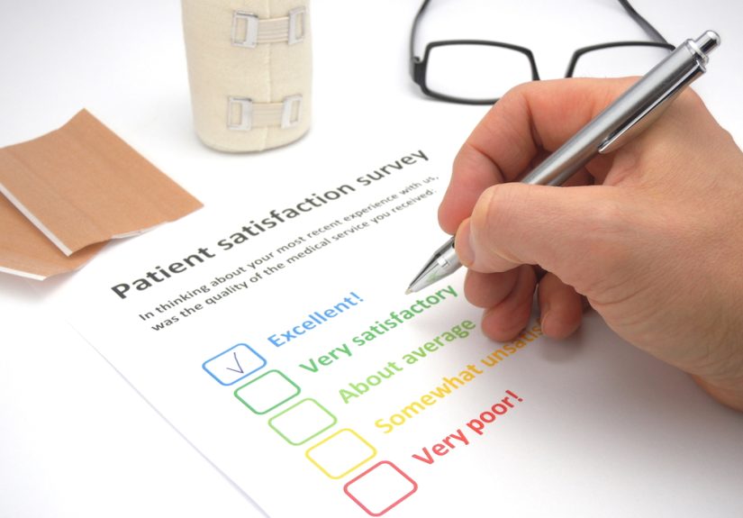
Experiences from the field: what poorly-designed surveys look like in real life (about )
Note: The examples below are composite, anonymized scenarios based on common healthcare operations patterns and patient feedback challenges.
Experience 1: The “Everything Is Fine” score that hid a discharge problem
A midsize hospital celebrated strong overall ratings for several quarters. Leadership meetings were cheerful, dashboards were green, and the patient experience committee looked like it deserved a trophy. Then readmissions for one service line began creeping up. A deeper review found a recurring issue: patients did not fully understand medication changes after discharge.
Why didn’t the survey catch it earlier? Because the local questionnaire relied heavily on broad satisfaction items like “How satisfied were you with your care?” Patients generally felt grateful and rated the hospital highly, even when they left confused. Once the team added more specific questions about discharge instructions and symptom warning signs, the signal became obvious. The score initially dropped, but the data became useful. Within months, the hospital standardized discharge teach-back and improved follow-up call scripts.
Experience 2: A web-only survey that missed older adults
A clinic switched to an email-only survey to save time and money. Response volume stayed decent, and leaders assumed the new process was working. But the respondent pool shifted. Younger, portal-active patients answered quickly, while many older patients and patients with limited digital access disappeared from the dataset.
The clinic’s patient satisfaction numbers looked stable, but front desk complaints about scheduling and phone hold times increased. When analysts compared respondents to the actual patient population, the gap was clear. The solution was not abandoning digital surveysit was adding a mixed-mode follow-up plan and reviewing response patterns by age and language preference. After that change, the scores became less flattering but much more representative. In this case, worse-looking numbers were actually better data.
Experience 3: Staff got blamed for a systems issue
On one inpatient unit, staff responsiveness scores fell sharply during a period of vacancy-related staffing strain. Managers initially pushed coaching on tone and bedside scripting, assuming the issue was communication style. Nurses were understandably frustrated: they were running, not relaxing.
When leaders layered survey feedback with staffing, call-light response times, and patient comments, the pattern changed the conversation. Patients were not saying staff were rude. They were saying help took too long to arrive. That distinction mattered. The fix included surge staffing support, clearer communication with patients about expected wait times, and revised rounding coverage. Scores improved laterbut more importantly, so did trust between leadership and frontline teams.
Experience 4: Too many questions, too little action
A health system created a “comprehensive” internal survey with so many items that completion rates slid and analysts needed a spreadsheet just to track which questions were still being used. Teams reviewed pages of results but struggled to identify priorities. Everyone had data; no one had direction.
Eventually, the organization cut the survey down, focused on a smaller set of actionable measures, and paired them with comment review. The result was less noise, faster decisions, and clearer accountability. The best improvement they made was not a new initiative. It was deleting questions that no longer served a purpose.
These experiences all point to the same lesson: patient satisfaction improves when healthcare organizations stop chasing easy survey wins and start designing feedback systems that reflect how care is actually delivered.