Table of Contents >> Show >> Hide
- 1. Prioritizing Looks Over Function
- 2. Ignoring Scale, Proportion, and Spacing
- 3. Treating Typography Like a Free-for-All
- 4. Forgetting Accessibility Until the Last Minute
- 5. Creating Confusing Navigation and User Flow
- 6. Overcrowding the Design
- 7. Misusing Color, Contrast, and Lighting
- 8. Designing for One Screen, One Moment, or One Ideal User
- 9. Skipping Testing, Measuring, and Mocking Up
- 10. Following Trends So Hard the Design Loses Personality
- A Quick Designer-Approved Checklist
- Conclusion
- Real-World Experiences Designers Learn From the Hard Way
- SEO Tags
Great design has a funny way of looking effortless. A room feels calm, a website feels intuitive, a brand feels polished, and nobody stops to say, “Wow, that spacing system is really carrying this experience.” But the second design goes wrong, everybody notices. Suddenly a living room feels cramped, a website feels like a maze designed by a caffeinated raccoon, and a gorgeous font choice becomes impossible to read the moment someone opens the page on a phone.
That is why designers across disciplines keep repeating the same warning: most design mistakes are not about a lack of taste. They are usually about a lack of clarity, testing, proportion, accessibility, or restraint. Whether the project is a homepage, a brand system, or a living room makeover, the most common design failures tend to come from choosing what looks impressive before asking what actually works.
Below are the most common design mistakes professionals say they see again and again, plus the practical fixes that make a design feel smarter, cleaner, and more human. Think of it as a designer-approved list of “please stop doing this” notes, delivered with love and only a tiny amount of side-eye.
1. Prioritizing Looks Over Function
This is the grand champion of design mistakes. Designers in digital, graphic, and interior spaces all say the same thing in different ways: if a design looks good but creates friction, it is not good design. A website with stunning visuals but confusing navigation will lose visitors. A room with dramatic furniture that blocks movement will feel annoying to live in. A minimal brand deck with no hierarchy may look slick in a mockup and still fail in the real world.
Function should lead the conversation. Good design supports how people move, read, click, rest, work, and live. That means the first questions should be practical ones. What is the user trying to do? What should they notice first? How fast can they understand the layout? Can they move through the space or interface without bumping into confusion?
How to fix it
Start every project by defining the purpose before styling the surface. If the design cannot help someone complete a task, understand a message, or comfortably use a space, the aesthetic layer is just fancy wrapping paper on a problem.
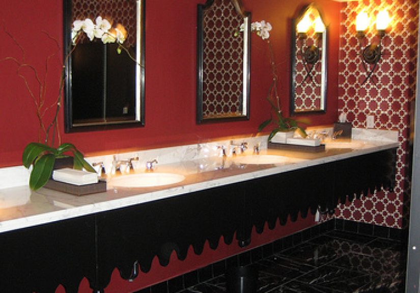
2. Ignoring Scale, Proportion, and Spacing
Ask interior designers what instantly makes a room feel off, and many will say the same things: rugs that are too small, art hung too high, furniture that is undersized or oversized, and layouts that ignore how people actually move through the room. Ask web and UX designers what makes a screen feel chaotic, and you will hear a related complaint: inconsistent spacing, weak hierarchy, cramped elements, and layouts that do not breathe.
Scale is not just a home design issue. It is a universal design principle. When elements are out of proportion, the whole composition starts to feel amateur, even if the individual pieces are attractive. Tiny buttons, oversized headlines, microscopic lamps, giant section gaps, and random padding are all members of the same unruly family.
How to fix it
Measure first. Use a consistent spacing system. Step back and review the whole composition, not just the parts. If something feels awkward, do not assume you need more stuff. You may simply need better proportion.
3. Treating Typography Like a Free-for-All
Typography mistakes are the design equivalent of wearing six colognes at once and calling it a signature scent. Designers constantly warn against using too many typefaces, weak contrast between text and background, poor line spacing, hard-to-scan blocks of copy, and decorative fonts where clarity should be the priority.
Type does far more than carry words. It establishes tone, hierarchy, and readability. When typography gets messy, everything else suffers. A site can have excellent information and still feel exhausting because the type choices make the content harder to absorb. A brand can look inconsistent because the fonts are fighting each other like rivals on a reality show reunion special.
How to fix it
Limit your type system. Make sure headings, subheads, and body copy are clearly distinguishable. Use font size, weight, contrast, and spacing with intention. The best typography often feels invisible because it helps the content shine instead of trying to become the main character.
4. Forgetting Accessibility Until the Last Minute
Designers increasingly describe accessibility as one of the most overlooked and most expensive mistakes to ignore. Low contrast text, missing labels, poor keyboard navigation, inaccessible forms, motion-heavy experiences, and vague link language are common problems online. In physical spaces, bad lighting, cluttered pathways, and impractical layouts can create similar issues for comfort and usability.
Accessibility is not a bonus round for extra credit. It is part of good design. If a product or space only works for people under perfect conditions with perfect vision, perfect dexterity, and endless patience, it is not designed well. It is just selective.
How to fix it
Build accessibility into the process from the beginning. Check contrast. Write meaningful labels. Make interactive elements easy to identify and use. Test with keyboard navigation. Reduce unnecessary motion. In home and spatial design, consider lighting, clearance, safety, and ease of movement. Inclusive design is not restrictive; it is smarter.
5. Creating Confusing Navigation and User Flow
A common web design mistake is making people think too hard. Menus become cluttered. Calls to action hide in plain sight. Pages scroll forever without telling users where to go next. Mobile layouts bury key information. The result is a site that technically works but feels like solving a puzzle nobody asked for.
Interior designers run into a version of the same issue when a room layout interrupts natural movement. Furniture blocks sight lines. There is no clear focal point. Seating arrangements make conversation awkward. The lesson is identical: people should not need instructions to understand how to move through a design.
How to fix it
Create a clear hierarchy of actions and decisions. What should users do first, second, and third? What should guests notice when they enter the room? The best flow feels obvious without feeling dumbed down. Clarity wins.
6. Overcrowding the Design
One of the most common mistakes designers mention is simple overstuffing. Too many throw pillows. Too many shelf objects. Too many pop-ups. Too many colors. Too many competing messages. Too many design trends in one place. Somewhere along the way, “more” became confused with “better,” and designers have been gently begging everyone to calm down ever since.
Clutter does not always look messy in the traditional sense. Sometimes it looks polished but overloaded. A room may be full of expensive pieces and still feel stressful. A landing page may be beautifully styled and still collapse under competing banners, animations, testimonials, badges, and three equally loud buttons screaming for attention.
How to fix it
Edit ruthlessly. Choose focal points. Give elements room to breathe. White space is not empty space; it is functional space. Negative space helps users scan, helps rooms feel calmer, and helps important details stand out.
7. Misusing Color, Contrast, and Lighting
Designers do not hate color. They hate color used without a plan. In interiors, poor lighting temperature, flat overhead lighting, and clashing palettes can make even expensive rooms feel awkward. In digital design, weak contrast, random accent colors, and color choices without hierarchy make interfaces harder to read and harder to trust.
Lighting is especially underestimated. Designers repeatedly point out that lighting can make or break a space. The digital equivalent is contrast and emphasis. When everything is muted, nothing feels important. When every button is bright, every message urgent, and every section styled like an emergency banner, the eye has nowhere to rest.
How to fix it
Use color and light strategically. Build a palette with roles, not just favorites. Layer lighting in physical spaces. Use contrast to create emphasis in digital spaces. Ask yourself what deserves attention first, and let color support that answer.
8. Designing for One Screen, One Moment, or One Ideal User
Another common mistake is designing for a fantasy scenario instead of real life. Maybe the mockup looks stunning on a giant monitor but falls apart on mobile. Maybe the email design is gorgeous until dark mode gets involved. Maybe the sofa looked perfect in the showroom but swallows the apartment whole. Maybe the all-white room looked elegant for a day and then met a dog, a child, and a cup of coffee.
Professional designers warn against assuming ideal conditions. Real users are distracted, in a hurry, on different devices, in different lighting environments, and often just trying to finish one task before lunch. Real homes collect stuff, wear, pets, cables, and chaos. Design has to survive reality, not just impress in a staged photo.
How to fix it
Test across devices, screen sizes, and real contexts. Check performance, responsiveness, and readability. In interiors, map pathways, measure clearances, and think about maintenance. Beautiful design that only works in perfect conditions is basically decorative fiction.
9. Skipping Testing, Measuring, and Mocking Up
A surprising number of design mistakes begin with impatience. People buy before measuring. They launch before testing. They pick paint before checking the light. They choose a trendy UI pattern because it looked cool in another product. Then reality arrives like an uninvited project manager with notes.
Testing is where theory meets truth. Usability reviews, prototypes, walkthroughs, content checks, room mockups, furniture measurements, and sample swatches all save money and stress. Designers are not obsessed with process because they enjoy extra steps. They love process because it prevents preventable disasters.
How to fix it
Slow down enough to test before you commit. Print it. Prototype it. Walk through it. Tape the dimensions on the floor. Review it on your phone. Ask another human to try it without explanation. If they look confused, congratulations: you found the problem before the internet did.
10. Following Trends So Hard the Design Loses Personality
Designers consistently warn against trend-chasing without context. Matching everything perfectly, copying viral aesthetics, using trendy features for the sake of novelty, or building a space that looks like a catalog instead of a real home all create the same issue: the design loses authenticity.
That does not mean trends are bad. They can be useful references. The problem starts when a trend overrides the actual needs, habits, and identity of the person using the design. Good design should feel intentional and alive, not like it was assembled entirely by algorithmic peer pressure.
How to fix it
Use trends as seasoning, not the whole meal. Keep the project rooted in purpose, audience, and personality. The best design feels current without becoming disposable.
A Quick Designer-Approved Checklist
- Does the design make the main action obvious?
- Is the spacing consistent and proportional?
- Is the typography easy to read at a glance?
- Does accessibility work as a built-in feature, not an afterthought?
- Can a first-time user or guest understand the layout quickly?
- Have you removed at least one unnecessary element?
- Does color support hierarchy instead of creating noise?
- Has the design been tested in real conditions?
- Does it feel personal, useful, and durable?
Conclusion
The most common design mistakes are rarely mysterious. Designers keep flagging the same issues because the fundamentals still matter: function, proportion, readability, accessibility, flow, and restraint. You can spend a fortune on finishes, fonts, furniture, software, or visuals, but if the experience feels frustrating, cluttered, or confusing, the design will still miss the mark.
The good news is that strong design is not about being flashy. It is about making better decisions, earlier and more consistently. Measure before buying. Test before launching. Edit before adding more. Choose hierarchy over chaos, usability over ego, and personality over trend-chasing. Do that, and your design will not just look better. It will work better, last longer, and make people feel more comfortable the moment they interact with it.
Real-World Experiences Designers Learn From the Hard Way
Talk to enough designers and you will notice a pattern: their best lessons usually came from projects that looked great in theory and went sideways in practice. One common story starts with a client who wants a “clean, minimal” website. The first mockup is gorgeous. Big hero image, tiny navigation, pale gray text, subtle buttons, lots of white space. Everyone on the team nods like they have just invented elegance. Then the test users arrive. Nobody knows where to click. Half of them miss the call to action. One person asks whether the faint body text is “supposed to be disabled.” Suddenly the design is still pretty, but now it also has consequences.
Interior designers tell the same kind of story in a different setting. A homeowner falls in love with a sofa online, measures roughly, and declares that it will “definitely fit.” It does fit, technically, in the same way a giraffe technically fits into a garage if nobody needs to move. The room loses flow, side tables no longer make sense, and the coffee table becomes a shin-hunting device. Or the opposite happens: everything is too small. Tiny rug, tiny art, tiny lamp, tiny accent chair. The room starts to look like it was furnished by a committee of cautious squirrels.
Brand and graphic designers have their own horror reels. Maybe a client insists on using five fonts because each one “communicates a different energy.” What it actually communicates is confusion. Or a team keeps adding more elements to a homepage because every department wants visibility. Marketing wants a banner. Sales wants another button. Leadership wants a founder quote. Product wants a video. Support wants a chat bubble. Before long, the page looks like a garage sale held inside a notification center.
One of the most valuable experiences many designers mention is learning that users do not interact with a design the way designers expect. People skim. They guess. They miss obvious things. They click the wrong area. They scroll past the part you were sure was impossible to miss. That is not a user failure. It is a design reality check. Experience teaches designers to stop falling in love with assumptions and start testing behavior.
Another hard-earned lesson is that trends age faster than fundamentals. A room packed with whatever was hot on social media last year can feel old surprisingly quickly. A website built around a trendy animation or clever interaction may look exciting in a portfolio but feel tiring in daily use. Designers who have been burned by that cycle tend to become more disciplined. They still appreciate style, but they trust clarity, comfort, and consistency more.
In the end, experience teaches a humbling truth: design is not about showing how creative you are at all times. It is about solving the right problem well, then knowing when to stop. The seasoned designer is not the one adding the most. It is usually the one who knows what to remove, what to test, what to resize, and when to say, “Nope, that rug is too small.”