Table of Contents >> Show >> Hide
- Quick cheat sheet (save this before your next “why is it cropped?!” moment)
- Before the sizes: 5 rules that prevent 90% of image disasters
- Instagram image sizes (2025)
- Facebook image sizes (2025)
- X (Twitter) image sizes (2025)
- LinkedIn image sizes (2025)
- TikTok image sizes (2025)
- YouTube image sizes (2025)
- Pinterest image sizes (2025)
- Snapchat image sizes (2025)
- Threads image sizes (2025)
- One “universal” size that helps link previews everywhere
- How to build a “2025-proof” social image system (so you stop resizing forever)
- Common mistakes (and how to avoid them)
- Conclusion
- Extra: of real-world experiences and lessons people run into (so you don’t have to)
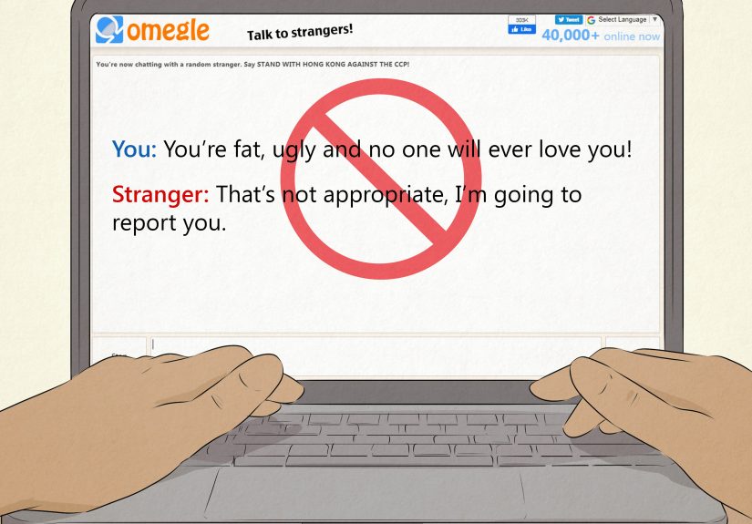
If you’ve ever uploaded a beautiful graphic and watched it get cropped like a bad haircut, you’re not alone.
In 2025, social platforms are still allergic to “one-size-fits-all” images. Every network has its own preferred
pixel dimensions, aspect ratios, and “safe zones” where text won’t get covered by buttons, captions, or your
audience’s thumb.
This guide gives you the updated, practical image sizes for the biggest platforms in 2025plus the real
reason your posts sometimes look blurry, weirdly zoomed, or mysteriously chopped. (Spoiler: it’s not a curse.
It’s compression.)
Quick cheat sheet (save this before your next “why is it cropped?!” moment)
If you remember nothing else, remember these three “workhorse” sizes. They cover the majority of day-to-day
content across platforms:
- Square: 1080 × 1080 (great for profile grids, many feed posts)
- Portrait feed: 1080 × 1350 (4:5) (max screen real estate in most feeds)
- Full-screen vertical: 1080 × 1920 (9:16) (Stories, Reels, TikTok, Shorts)
Before the sizes: 5 rules that prevent 90% of image disasters
1) Pixels matter more than “DPI” for social
Social platforms care about pixel dimensions (width × height) and aspect ratio, not print-style DPI.
Export at the correct pixel size and you’re already ahead of most of the internet.
2) Aspect ratio is the boss; pixel size is the employee
Platforms scale images up/down, but they crop based on aspect ratio. If your design is the wrong shape,
it will get trimmed like a hedgewhether you asked for it or not.
3) Design with safe zones (a.k.a. “keep text away from the edges”)
Buttons, captions, profile icons, and UI overlays cover parts of your image. If you place key text in the bottom
corners of a Story, you’re basically hiding your message behind the interface.
4) Upload bigger than display size (but don’t go wild)
Many platforms display profile photos very small, but recommend uploading higher-resolution images for crispness.
A good rule: upload at least 2× the smallest display size when possible, within platform file limits.
5) Choose the right format
- JPG: best for photos and gradients; smaller files
- PNG: best for text-heavy graphics, logos, sharp edges, transparency
- WEBP: supported in some places; great compression, but not universal in every workflow
Instagram image sizes (2025)
Instagram is still the king of “looks perfect… until it hits the grid.” In 2025, the biggest practical change
creators talk about is how the profile grid preview behaves: posts can be displayed in a taller preview format,
which means your carefully centered composition can suddenly feel “reframed.”
| Asset | Recommended size (px) | Aspect ratio | Notes |
|---|---|---|---|
| Profile photo | 320 × 320 | 1:1 | Displays as a circlekeep logos/faces centered. |
| Square feed post | 1080 × 1080 | 1:1 | Classic format; safe for grids but not the biggest on-screen. |
| Portrait feed post | 1080 × 1350 | 4:5 | Often the best-performing layout for feed visibility. |
| Landscape feed post | 1080 × 566 | 1.91:1 | Great for wide shots; can look smaller in vertical feeds. |
| Stories | 1080 × 1920 | 9:16 | Keep key text in the middle; edges may be covered by UI. |
| Reels (video + cover) | 1080 × 1920 | 9:16 | Reels appear in multiple places; center important elements. |
Instagram 2025 pro tip: design for “multiple crops”
A Reel cover might be full-screen (9:16) in the Reels tab, but it can appear more like a feed crop elsewhere.
The safest approach: treat the center as sacred. Put faces, logos, and headline text in the central “safe” area,
and keep decorative elements toward the edges.
Example workflow: one design, three Instagram placements
- Create a master canvas at 1080 × 1920 (vertical).
- Keep the core message inside a centered “box” (roughly the middle 70% of the image).
- Export:
- Story/Reel version: 1080 × 1920
- Feed portrait crop: 1080 × 1350 (crop from the center)
- Square teaser: 1080 × 1080 (crop center again)
Facebook image sizes (2025)
Facebook is still a multi-surface platform: feed, Stories, Reels, Pages, Groups, Events, link previews…
Translation: Facebook can show the same image in different ways depending on where it appears.
| Asset | Recommended size (px) | Aspect ratio | Notes |
|---|---|---|---|
| Profile photo (Page) | At least 320 × 320 (upload higher for crispness) | 1:1 | Displays as a circle in many placescenter the subject. |
| Cover photo | 851 × 315 (common recommended upload) | ~2.7:1 | Design inside the center; mobile crops differently than desktop. |
| Feed post (square) | 1080 × 1080 | 1:1 | Reliable for most feed placements and reshares. |
| Feed post (landscape link preview) | 1200 × 630 | 1.91:1 | Best for links and Open Graph previews. |
| Stories / Reels | 1080 × 1920 | 9:16 | Keep text away from the top/bottom UI overlays. |
Facebook cover photo reality check
People view covers on phones, tablets, desktops, and “my uncle’s ancient laptop.” Even if you upload the perfect
size, Facebook may crop or reposition. Treat the center as the safe zone and avoid putting critical text near the
edges. If your cover is text-heavy, consider exporting as PNG for sharpness.
X (Twitter) image sizes (2025)
X is fast-moving and text-first, but images still boost attention. The catch: the feed crops previews depending
on the post layout and device. Make your visuals readable at phone size, because that’s where most scrolling happens.
| Asset | Recommended size (px) | Aspect ratio | Notes |
|---|---|---|---|
| Profile photo | 400 × 400 | 1:1 | Displays as a circle in many contextscenter key elements. |
| Header (banner) | 1500 × 500 | 3:1 | Expect some cropping; keep text/logo toward the center. |
| Single image in post | 1200 × 675 (or larger at same ratio) | 16:9 | Great for clean previews; avoid tiny text. |
| Square graphic | 1080 × 1080 | 1:1 | Often safe when you’re unsure about cropping behavior. |
X design tip: write like a billboard
If your image includes text, assume people are reading it while walking, holding coffee, and making questionable
life choices. Use big type, high contrast, and short phrases. You’re not designing a novel cover.
LinkedIn image sizes (2025)
LinkedIn is where “professional” visuals matter, but the platform is surprisingly specific about company Page
images and link-preview ratios. Good sizing here makes your brand look polished instead of “cropped in a hurry.”
| Asset | Recommended size (px) | Aspect ratio | Notes |
|---|---|---|---|
| Personal profile photo | 400 × 400 | 1:1 | Displays as a circle; leave breathing room around edges. |
| Personal banner | 1584 × 396 | 4:1 | Keep key content centered; mobile crops can surprise you. |
| Company Page logo | 400 × 400 | 1:1 | Upload crisp, high-resolution; avoid tiny text in logos. |
| Company Page cover | 4200 × 700 | 6:1 | Wide layoutuse minimal text and avoid edge-hugging elements. |
| Link preview image (Page post with URL) | 1200 × 627 | 1.91:1 | LinkedIn specifically calls out this ratio for URL posts. |
| Square post image | 1200 × 1200 | 1:1 | Simple, clean format for carousels and graphic quotes. |
LinkedIn example: one webinar promo, two versions
Let’s say you’re promoting a webinar. Create:
- Square graphic (1200 × 1200): big headline, date/time, speaker photo
- Link preview image (1200 × 627): simplified headline + logo, no tiny text
Why two? Because link previews are often smaller on-screen than a native image post. If you cram a full flyer
into a link preview, you’ll end up with unreadable text (and a sad marketing team).
TikTok image sizes (2025)
TikTok is video-first, but images still matter: profile photos, carousel posts, and ad creatives.
The platform is vertical by nature, so full-screen designs win.
| Asset | Recommended size (px) | Aspect ratio | Notes |
|---|---|---|---|
| Profile photo | Upload square at high resolution (commonly 400 × 400+) | 1:1 | Displays small and circular in the UI; keep it bold and simple. |
| Vertical creative (organic + many ads) | 1080 × 1920 | 9:16 | Best for full-screen; design with center-safe text placement. |
| Image ad dimension options (commonly supported) | 1080 × 1920 (plus other supported variants) | 9:16 | Ad tools may accept multiple dimensions; 9:16 is the safest bet. |
TikTok creative tip: assume sound-off and speed-scrolling
Even though TikTok is known for audio, plenty of users scroll with sound off. Make your message readable without
relying on voiceover. Think “caption-first,” with a clean hierarchy: headline → proof → call to action.
YouTube image sizes (2025)
YouTube’s biggest image “gotcha” is channel art: it displays differently across TV, desktop, tablet, and mobile.
That’s why safe zones matter here more than almost anywhere else. Thumbnails also matter because they’re your
billboard in search and suggested videos.
| Asset | Recommended size (px) | Aspect ratio | Notes |
|---|---|---|---|
| Channel banner (channel art) | 2560 × 1440 | 16:9 | Keep key text/logos in the central safe area (1546 × 423). |
| Video thumbnail | 1280 × 720 | 16:9 | Readable text + strong face/subject; avoid tiny details. |
| Profile photo | 800 × 800 | 1:1 | Displays small; keep it clean, high contrast. |
| Shorts cover / vertical creative | 1080 × 1920 | 9:16 | Design center-safe; UI overlays can cover edges. |
YouTube thumbnail mini-checklist
- Use 3–6 words max if you add text.
- High contrast, big subject, clean background.
- Test at phone size: zoom out until it’s tinydoes it still read?
Pinterest image sizes (2025)
Pinterest is where images behave more like search results than social posts. “Pin size” is basically SEO for your
visuals: correct dimensions help your content look crisp and take up the right amount of space in the feed.
| Asset | Recommended size (px) | Aspect ratio | Notes |
|---|---|---|---|
| Standard Pin | 1000 × 1500 | 2:3 | The go-to format for most content and campaigns. |
| Square Pin | 1000 × 1000 | 1:1 | Works, but often takes less vertical space than 2:3 Pins. |
| Full-screen vertical (some ad formats) | 1080 × 1920 | 9:16 | Used for immersive, full-bleed experiences. |
Pinterest example: repurpose an Instagram portrait post
You can often repurpose a 1080 × 1350 Instagram portrait into Pinterest’s 1000 × 1500 format
with minimal effort:
- Start from the original high-res photo.
- Create a Pinterest version with more vertical breathing room.
- Add a clear title overlay (but keep it short and readable).
- Export at 1000 × 1500 to match the native Pin shape.
Snapchat image sizes (2025)
Snapchat is built for vertical, immersive creative. For ads and sponsored formats, think “full-screen phone”
and keep essential text away from UI overlays.
| Asset | Recommended size (px) | Aspect ratio | Notes |
|---|---|---|---|
| Single image/video ad (spec baseline) | 720 × 1280 (minimum spec in many formats) | 9:16 | Vertical required; export higher if possible for crispness. |
| Branded chat background (Sponsored Snaps element) | 1080 × 1920 | 9:16 | Use clean composition; avoid tiny text. |
Snapchat creative tip: keep your CTA high
Many Snapchat placements place interactive UI near the bottom. If your call to action is sitting at the bottom
edge, it may be partially covered. Keep CTAs higher and make them visually obvious.
Threads image sizes (2025)
Threads is closely tied to the Instagram ecosystem, so many creators use the same image playbook:
square and portrait posts, plus clean, center-safe composition.
| Asset | Recommended size (px) | Aspect ratio | Notes |
|---|---|---|---|
| Profile photo | 320 × 320+ | 1:1 | Displays as a circle; reuse your Instagram brand mark if helpful. |
| Image post (portrait) | 1080 × 1350 | 4:5 | Great for readability in a scroll-first feed. |
| Image post (square) | 1080 × 1080 | 1:1 | Safe, classic, easy to repurpose across networks. |
One “universal” size that helps link previews everywhere
If your content includes links (blogs, product pages, landing pages), you’ll eventually meet the Open Graph
image. This is the preview image that appears when someone shares your URL.
A widely recommended standard is 1200 × 630 (1.91:1). It plays nicely with many social previews and
looks sharp on high-resolution screens. If you’re serious about sharing links, create a reusable template at this size:
headline, brand mark, and a simple background imagedone.
How to build a “2025-proof” social image system (so you stop resizing forever)
Step 1: Create four master templates
- Square: 1080 × 1080
- Portrait feed: 1080 × 1350
- Vertical full-screen: 1080 × 1920
- Link preview: 1200 × 630
Step 2: Use a “center-safe” layout grid
Build your design so the core message sits in the center. Think of it like filming: the subject goes in the
safe frame, not in the corners where it might get cut off. Decorative elements can live near the edges.
Step 3: Export smart, not heavy
- Photos: JPG, high quality, reasonable file size
- Text-heavy graphics: PNG (or high-quality JPG if size is an issue)
- Always preview on your phone before publishing
Step 4: Test like a grown-up (annoying but effective)
Post a test image to a private account or draft area if possible. Check:
- Feed view (does it crop?)
- Grid view (does your headline still make sense?)
- Story/Reels view (is anything hidden behind UI?)
Common mistakes (and how to avoid them)
Mistake: Designing a Story like it’s a poster
Posters love tiny details. Stories do not. Keep it simple: one message, one visual hook, one clear CTA.
Mistake: Putting logos in corners
Corners are where UI goes to party. Put logos in the upper-middle or center-safe area, depending on the platform.
Mistake: Exporting from a screenshot
Screenshots are already compressed. Use original files whenever possible; your audience can spot a blurry graphic
from a mile away (and they will judge you quietly).
Mistake: “It looks fine on my phone” syndrome
Test on at least one other device or preview size. If you can’t, zoom out on your phone and check readability at
small sizes. If it fails the squint test, fix it.
Conclusion
Social media image sizes in 2025 are less about memorizing every pixel dimension and more about building a repeatable
system: pick the right aspect ratio, design with safe zones, export cleanly, and test where your audience actually
scrolls (hello, mobile).
Start with four master templates (square, portrait, vertical, link preview) and you’ll cover most day-to-day needs
across Instagram, Facebook, X, LinkedIn, TikTok, YouTube, Pinterest, Snapchat, and Threadswithout spending your life
inside a crop tool.
Extra: of real-world experiences and lessons people run into (so you don’t have to)
The most common “experience” people report when they finally take image sizing seriously is that their workflow
suddenly gets calmer. Not perfectsocial platforms are still unpredictablebut calmer. Here are the practical,
lived-in lessons creators, marketers, and small businesses commonly bump into:
1) The “my text disappeared” Story problem
Someone designs a gorgeous 1080 × 1920 Story, places the call-to-action at the very bottom (“Swipe up” energy),
and then wonders why it’s partially hidden. The fix is almost always the same: move key text toward the center
and treat the bottom area as unsafe. The experience here is humbling, because it’s not a design skill issueit’s
a platform UI reality issue.
2) The Instagram grid “reframe” shock
People often build their Instagram grid like a museum wall: carefully aligned, visually satisfying, symmetrical.
Then a grid preview crops differently and the “museum wall” becomes “abstract chaos.” The practical lesson many
learn is to stop making the grid do heavy lifting. Use the feed post itself to tell the story; make the grid
a bonus, not the whole strategy. A simple center-safe composition prevents most heartbreak.
3) The “why does Facebook look worse than my original file?” mystery
Facebook compression is a recurring complaint. The experience usually goes like this: you upload a crisp graphic,
it looks fine in your file, then it looks slightly soft onlineespecially if it has thin lines or small text.
People solve this by exporting PNG for text-heavy designs, increasing font size, and avoiding ultra-thin strokes.
Another common lesson: don’t judge quality from a single view; Facebook renders differently in different placements.
4) LinkedIn: where small changes feel huge
LinkedIn audiences notice polish. A slightly cropped banner or fuzzy logo can make a brand feel less credible,
even if the content is strong. Many teams learn to keep banners minimalone clear message, one visual theme,
and plenty of breathing room. The “experience” is that simpler designs often perform better because they survive
responsive resizing without breaking.
5) The TikTok/Shorts speed test
On vertical video platforms, people scroll fast. A common learning moment is realizing that the first second is a
thumbnail, headline, and hook all at once. Creators often redesign overlays to be bigger, bolder, and higher on the
frame. If someone can’t understand what they’re looking at instantly, they’re gone. It sounds harsh, but it’s also
freeing: you can design with clarity as your priority, not perfection.
6) The “template library” turning point
The biggest productivity upgrade people describe is building a small library of templates: square, portrait feed,
vertical full-screen, and link preview. Once those exist, posting becomes swapping photos and updating headlinesnot
reinventing the wheel every time. The lesson is simple: consistent sizing isn’t just about aesthetics; it’s about
speed, consistency, and fewer last-minute panic edits.