Table of Contents >> Show >> Hide
- Why Blue Plays Nice With (Almost) Everything
- Quick Color Theory (No Art Degree Required)
- 10 Blue Color Combinations to Try
- 1) Blue + Crisp White: The “Always Works” Classic
- 2) Blue + Warm Cream or Beige: Softens the Chill
- 3) Blue + Soft Gray or Greige: Modern, Calm, and Easy
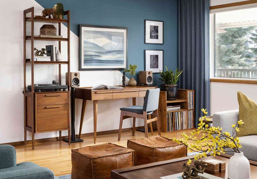
- 4) Blue + Natural Wood Tones: The Shortcut to “Cozy”
- 5) Blue + Brass or Gold: Instant Glow-Up
- 6) Blue + Terracotta or Burnt Orange: Bold, Earthy, and Balanced
- 7) Blue + Mustard or Ochre Yellow: Cheerful, Not Childish
- 8) Blue + Sage or Forest Green: Nature-Inspired and Layered
- 9) Blue + Blush Pink or Coral: Fresh Contrast with Personality
- 10) Blue + Deep Red or Burgundy: Dramatic, Cozy, and Unexpected
- How to Make Your Blue Palette Look “Designed,” Not Random
- Conclusion: Blue Is the Ultimate Team Player
- of Real-World Experience: Living With Blue (and Its Many Opinions)
Blue is the rare color that can be a leading actor and a reliable supporting character. It can read as coastal and casual, tailored and traditional, moody and modern, or bright and playfulsometimes all in the same room, depending on lighting and finishes. The only real trick is pairing it with the right “friend” colors so your space looks intentional, not like a paint swatch exploded.
Why Blue Plays Nice With (Almost) Everything
Think of blue as the design-world equivalent of great jeans: it’s easy to live with, it flatters most styles, and it doesn’t demand that every other color in the room be “the main character.” From airy sky blues to inky navies and jewel-toned cobalt, blue has a wide emotional rangecalming, crisp, grounded, sophisticated, or energeticso it adapts to what you pair it with.
The best color combinations with blue usually do one of three things: balance blue’s coolness with warmth (hello, wood and terracotta), amplify its freshness with clean neutrals (white, cream, soft gray), or energize it with contrast (yellow, coral, red, chartreuse).
Quick Color Theory (No Art Degree Required)
If color theory makes your eyes glaze over, keep it simple:
- Complementary pairings sit opposite each other on the color wheel (blue + orange). High contrast, high impact.
- Analogous pairings sit next to each other (blue + green, or blue + purple). Calm, layered, “designer did this on purpose.”
- Neutrals aren’t “no color”they’re the quiet glue that makes bold colors feel livable (white, cream, taupe, gray, black).
One more helpful concept: undertones. A navy with green undertones can feel more “maritime,” while a navy with purple undertones feels more “evening suit.” The warmer your blue looks, the easier it is to pair with warm accents. The cooler it looks, the more it loves crisp whites, grays, and silvery metals.
When in doubt, use the classic 60–30–10 rule: 60% dominant (walls/large pieces), 30% secondary (upholstery/rugs), 10% accent (art/pillows/metal finishes). This keeps bold blue color palettes from turning into a group chat where everyone is yelling.
10 Blue Color Combinations to Try
1) Blue + Crisp White: The “Always Works” Classic
Blue and white is timeless for a reason: it feels fresh, clean, and instantly pulled togetherlike your home just brushed its teeth and put on sunscreen. It’s also incredibly flexible: navy + white reads preppy and tailored; sky blue + white reads breezy and coastal.
- Where it shines: kitchens, bathrooms, bedrooms, entryways
- Try it like this: blue cabinets with white walls, or white bedding against a blue accent wall
- Pro move: vary textures (tile, linen, matte paint, glossy trim) so the palette feels layered, not flat
2) Blue + Warm Cream or Beige: Softens the Chill
If stark white feels too sharp, swap in cream, ivory, sand, or beige. This pairing keeps blue feeling calm while adding warmththink beach house, but the elevated version where the throw pillows look expensive and no one tracks in actual sand.
- Where it shines: living rooms, bedrooms, open-concept spaces
- Try it like this: light blue walls with creamy curtains, or navy accents against warm beige upholstery
- Watch-outs: match warmth levelscool, icy blues can make yellow-beige look dingy
3) Blue + Soft Gray or Greige: Modern, Calm, and Easy
Blue with gray is a quiet powerhouse. It’s soothing without being sleepy, modern without feeling sterileespecially when you keep both colors at a similar intensity (light blue + light gray, deep blue + charcoal). The result is calm, cohesive, and very “I have my life together,” even if your junk drawer says otherwise.
- Where it shines: basements, bedrooms, home offices, media rooms
- Try it like this: slate-blue sofa with warm gray walls; powder-blue paint with greige rugs
- Pro move: add one warm accent (wood, brass, tan leather) to keep gray from feeling chilly
4) Blue + Natural Wood Tones: The Shortcut to “Cozy”
Wood is basically blue’s favorite plus-one. Pairing blue with oak, walnut, rattan, cane, or even cork adds warmth and texture, grounding blue’s coolness. This combo also works across styles: coastal (light oak + airy blue), mid-century (walnut + teal), modern organic (navy + warm white oak).
- Where it shines: living rooms, dining rooms, kitchens, hallways
- Try it like this: navy walls with warm wood furniture; denim-blue textiles with natural woven baskets
- Pro move: repeat the wood tone 2–3 times (table, picture frames, shelves) so it looks intentional
5) Blue + Brass or Gold: Instant Glow-Up
Want blue to look richer and more dramatic? Add brass or gold. Metallic warmth makes deep blues feel luxe, and even pale blues look more polished. The key is treating metal like punctuation: a little goes a long way, but the right amount makes the whole “sentence” sing.
- Where it shines: dining rooms, powder rooms, kitchens, statement lighting moments
- Try it like this: navy cabinets + brass pulls; blue wall paint + warm metal sconces
- Pro move: mix metals carefullyif you have brass, keep other metals warm (aged bronze) or use black for contrast
6) Blue + Terracotta or Burnt Orange: Bold, Earthy, and Balanced
This is the complementary color pairing that never fails: blue + orange. In real life, you don’t have to go full traffic-cone orangeterracotta, rust, clay, and burnt orange give you the contrast without the chaos. The vibe is grounded, welcoming, and a little artsy (in a good way).
- Where it shines: living rooms, kids’ spaces, eclectic interiors, Southwestern-inspired palettes
- Try it like this: deep blue walls with terracotta pottery; blue bedding with rust throw pillows
- Pro move: use orange tones in textured materials (ceramic, leather, woven textiles) to keep them sophisticated
7) Blue + Mustard or Ochre Yellow: Cheerful, Not Childish
Blue and yellow are classic, but the trick is choosing the right yellow. Mustard, goldenrod, and ochre feel warmer and more grown-up than bright lemon. Together, they create a lively palette that still looks curatedlike sunshine wearing a blazer.
- Where it shines: family rooms, kitchens, creative offices, accent-heavy spaces
- Try it like this: navy + mustard pillows; light blue walls with warm yellow artwork
- Watch-outs: if your blue is very cool, pick a yellow with a bit of softness (not neon)
8) Blue + Sage or Forest Green: Nature-Inspired and Layered
Blue + green is an analogous schemeneighbors on the color wheelso it feels harmonious and calming. Sage and muted greens make light blue feel spa-like; forest and emerald greens make navy feel deep and luxurious. This combo works especially well when you add natural textures.
- Where it shines: bedrooms, bathrooms, reading nooks, anywhere you want “calm but not boring”
- Try it like this: pale blue walls with sage upholstery; navy accents with deep green plants and art
- Pro move: let one color dominate and use the other as a supporting roleotherwise it can get “underwater” fast
9) Blue + Blush Pink or Coral: Fresh Contrast with Personality
Pink and blue can feel juvenile if both are super sweet and pastel. But when you pair a softer blush with a more grounded blueor a bold coral with a deep navythe result is sophisticated, playful, and surprisingly versatile. Think “cool confidence” with a side of charm.
- Where it shines: bedrooms, nurseries (yes, but make it chic), living rooms with modern art
- Try it like this: navy sofa + blush pillows; light blue walls + coral accents in a rug or artwork
- Pro move: keep at least one element neutral (cream, tan, or warm white) to avoid candy-store vibes
10) Blue + Deep Red or Burgundy: Dramatic, Cozy, and Unexpected
Blue and red are both bold, but that’s the point. Burgundy, brick red, and wine tones add warmth and depth to blue, creating a moody, inviting palette that feels classic with a twist. If navy is your anchor, burgundy is the velvet rope that makes the room feel exclusive.
- Where it shines: dining rooms, libraries, cozy living spaces, vintage-inspired interiors
- Try it like this: navy walls + burgundy accents in textiles; cobalt accessories with deeper red artwork
- Watch-outs: keep one color dominanttwo equally loud colors can feel competitive
How to Make Your Blue Palette Look “Designed,” Not Random
Even the best blue color combinations can flop if the application is messy. Here’s what usually separates “Wow, that’s gorgeous” from “Why does this feel slightly stressful?”
Use Blue as Either the Base or the Accent (Pick One)
If blue is your wall color, keep major furniture pieces more neutral and bring in the second color through accents. If blue is your sofa, let it be the hero and keep the walls calmer. You can absolutely use blue in multiple placesjust make it clear what the star of the show is.
Mind the Lighting (Blue Is a Shape-Shifter)
Blues can look wildly different depending on natural light, warm bulbs, and surrounding surfaces. A blue that feels crisp in daylight can turn moody at night, and a deep blue can read almost black in low light. Test samples and observe them throughout the day before committing.
Add Texture to Keep the Palette From Feeling Flat
Blue + white can look coastal-chic… or like a dentist’s waiting room. Texture fixes that. Think: linen, wool, woven baskets, matte ceramics, aged metals, wood grain, or a patterned rug that repeats both colors.
Conclusion: Blue Is the Ultimate Team Player
If you’ve ever wondered, “What colors go with blue?” the short answer is: plenty. The better answer is: the best pairing depends on the mood you want. Blue + white is crisp and timeless. Blue + beige is warm and approachable. Blue + terracotta is bold and balanced. Blue + brass is instantly elevated. Once you know whether you want calm, contrast, or coziness, choosing your second color gets a whole lot easier.
Start with one of the 10 combinations above, keep undertones in mind, and use texture and proportion to make the palette feel intentional. Then step back and admire your workpreferably with a beverage, because that’s what adults do when they make good color decisions.
of Real-World Experience: Living With Blue (and Its Many Opinions)
The first time I “committed” to blue in a room, I did what many confident beginners do: I chose a gorgeous swatch in a store, carried it home like a trophy, and then watched it transform into something completely different under my lights. In the morning it was crisp and coastal; at night it leaned deep and stormylike the room had developed feelings. That was my first lesson: blue is a mood ring with excellent PR.
Over the years, I’ve noticed blue behaves best when it has something warm nearby. A navy wall next to a walnut table instantly looks intentional, while the same navy next to a cool gray sofa can feel a little “winter business meeting.” The fix is rarely a total redo; it’s almost always an adjustmentadding a tan leather pillow, swapping chrome for brass, or bringing in a woven rug that introduces beige and texture. Blue doesn’t demand perfection, but it does demand context.
I’ve also learned that the “right” blue depends on the job you’re hiring it for. Want a bedroom to feel like exhaling? Light blue plus soft neutrals is unbeatable, especially with layers of white and cream. Want a dining room that feels grown-up and dramatic? Deep blue with brass and a little burgundy is practically cheating. Want your kitchen to feel clean but not sterile? Blue cabinets with warm whites (not icy whites) and a wood or rattan element keeps everything friendly.
The most helpful trick I’ve used is building a palette the way you’d build an outfit. If blue is the “jeans,” pick a top that sets the tone: white for crisp, cream for cozy, black for modern, terracotta for artsy, mustard for playful. Then add “accessories” that repeat the story: a small piece of art that includes both colors, a throw blanket that bridges them, or hardware that warms up the whole look.
Finally: don’t underestimate how much blue loves repetition. If you have a blue sofa, echo that blue somewhere elsean art print, a vase, a stripe in the rugso it feels like a deliberate choice, not a random purchase made during a late-night scrolling incident. Blue is forgiving, but it’s also smart. Treat it like a design partner, not a paint chip, and it will make almost any room look better than it has any right to.