Table of Contents >> Show >> Hide
- The 2026 Bedroom Color Cheat Sheet
- 1) Tailored Khaki and Oatmeal Neutrals
- 2) Buttercream and Lofty Whites
- 3) Deep Clay and Terracotta: The New Cozy
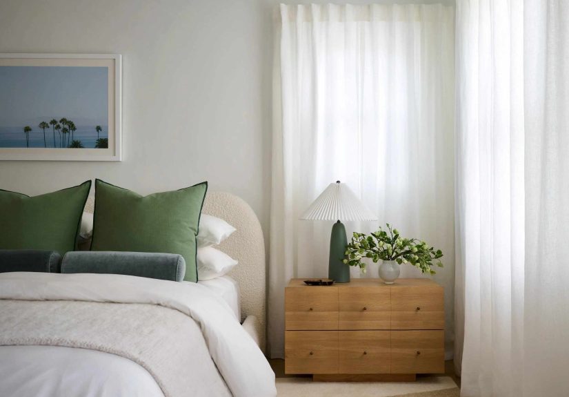
- 4) Smoky Blue-Greens and Jade “New Neutrals”
- 5) Blues That Range from Coastal Calm to Midnight Navy
- 6) Deep Plum, Eggplant, and Wine-Adjacent Drama
- 7) Chocolate, Tobacco, and Warm Mahogany Browns
- How to Choose the Right 2026 Trend for Your Bedroom
- Real-Life Bedroom Paint Experiences in 2026 (The Stuff People Don’t Tell You Until After the Roller Is Washed)
- Conclusion: The Best 2026 Bedroom Color Is the One You’ll Still Love in 2027
In 2026, the bedroom has officially been promoted from “place where laundry goes to retire” to “personal sanctuary.”
And paint is doing most of the heavy lifting. The big shift this year isn’t about chasing a flashy new color just to
post it once and then quietly hate it in six weeks. It’s about choosing a mood you want to live innight after night,
season after season.
Designers and major color forecasts are pointing in the same direction: warmer neutrals, richer earth tones, and
complex, calming hues that feel cozy without turning your bedroom into a cave (unless you want a caveno judgment).
Bright, icy whites and cool grays are losing their grip, replaced by colors with softness, depth, and a little bit of
soul.
The 2026 Bedroom Color Cheat Sheet
- Tailored khaki + oatmeal neutrals (warm, grounded, looks expensive even with IKEA nightstands)
- Buttercream + lofty whites (soft light, flattering glow, zero “hospital hallway” energy)
- Deep clay + terracotta (sunbaked warmth, instant “I sleep like a responsible adult” vibe)
- Smoky blue-greens + jade (the “new neutral” when beige feels boring)
- Coastal blue to midnight navy (calm, timeless, and shockingly good at hiding scuffs)
- Deep plum + eggplant (romantic, cocooning, and surprisingly versatile)
- Chocolate + warm mahogany browns (rich, cozy, and made for texture-heavy bedding)
1) Tailored Khaki and Oatmeal Neutrals
If 2025 was the year we admitted we were tired of cold gray, 2026 is the year we replace it with neutrals that feel
like they’ve had a good night’s sleep. Think khaki, oatmeal, sand, and “soft mushroom” tonesneutrals with warmth,
subtle undertones, and real dimension.
Why it’s trending
These shades look clean and intentional, but not sterile. They play well with natural wood, linen, boucle, leather,
brass, black accents, and basically any “I want my room to feel calmer” impulse purchase. They also photograph well
in both daylight and warm lamplightbecause yes, lighting is still the main character.
Try it like this
- Whole-room calm: Use a khaki or oatmeal on walls and keep trim a soft, creamy white.
- Quiet contrast: Add a deeper tan on doors or built-ins for a tailored look.
- Style pairing: Works especially well with warm woods, jute rugs, and textured bedding (waffle weaves, quilts, chunky knits).
Real-world shade cues: Universal Khaki (SW 6150), Stirabout, Sherwood Tan 1054.
2) Buttercream and Lofty Whites
White bedrooms aren’t going anywhere. They’re just… evolving. Instead of blinding, bright-white walls that make you
feel like you should be wearing a lab coat, 2026 favors whites with softness: creamy off-whites, buttery ivories, and
gentle, airy whites that sit comfortably between warm and cool.
Why it’s trending
Soft whites are the ultimate “supportive friend” color: they lift the room, flatter your furniture, and give you
breathing room to play with bolder textiles. They also help smaller bedrooms feel more open while still feeling
invitingespecially when layered with warm lighting and natural materials.
Try it like this
- Glow-up formula: Off-white walls + creamy trim + warm brass or aged bronze hardware.
- Texture is the trick: Add linen drapery, a woven headboard, and a nubby rug so the room doesn’t feel flat.
- Finish matters: Eggshell or matte walls keep it soft; semi-gloss belongs on trim and doors, not your entire personality.
Real-world shade cues: Cloud Dancer (PANTONE 11-4201), Swiss Coffee (OC-45), “buttercream” off-whites.
3) Deep Clay and Terracotta: The New Cozy
Clay tones are having a very “main character in a slow, beautiful movie” moment. In 2026 bedrooms, you’ll see
everything from soft, dusty clay to deeper umber-leaning terracottacolors that feel warm, earthy, and protective.
Why it’s trending
Clay shades read as comforting and grounding, which is exactly what most people want in a bedroom. They also bridge a
lot of styles: desert modern, rustic, traditional, eclectic, even minimal spaces that need warmth.
Try it like this
- Accent wall, zero regret: Paint the wall behind the headboard in a deep clay and keep the others a warm off-white.
- Full-room hug: Go all-in with four walls and balance with light bedding and pale wood.
- Palette pairing: Clay + cream + muted olive is a 2026 power trio.
Real-world shade cues: Fresh Clay, Southwest Pottery 048, “sunbaked hues” and terracotta families.
4) Smoky Blue-Greens and Jade “New Neutrals”
If you want color but you also want to sleep (a reasonable request!), smoky blue-greens are the sweet spot. These
aren’t loud teals or tropical aquas. Think jade with a veil of gray, blue-green that shifts with the light, and
muted tones that feel both grounded and fresh.
Why it’s trending
This family hits the rare combination of calming and interesting. It can act like a neutralespecially with
simple bedding and natural textureswhile still giving your room personality. It also pairs beautifully with warm
metals (brass, copper), dark woods, and creamy whites.
Try it like this
- Color-drench (the 2026 flex): Use the same blue-green on walls, trim, and even the ceiling for a cocoon effect.
- Soft contrast: Pair smoky jade walls with warm white trim and camel leather accents.
- Textile tip: Add bedding in oatmeal, ivory, or warm gray so the walls feel restful, not busy.
Real-world shade cues: Hidden Gem (N430-6A), “misty blue-green” families, Viridian Odyssey.
5) Blues That Range from Coastal Calm to Midnight Navy
Blue is the perennial bedroom favorite, but 2026 is widening the range. You’ll see airy coastal blues that feel
breezy and clean, plus deeper midnight blues and navies that create a luxe, wrapped-in-velvet mood.
Why it’s trending
Blue is dependable without being boring. Lighter blues feel crisp and soothing; darker blues feel dramatic and
cocooning. And unlike some trend colors that scream “I saw this on the internet,” blue tends to age gracefully.
Try it like this
- Coastal calm: Soft blue walls + white trim + warm wood = instant “vacation brain.”
- Midnight mood: Navy walls + creamy bedding + brass lighting for a hotel-like bedroom.
- Lighting tip: In darker blues, plan for layered lighting (overhead + bedside + a soft lamp) so it feels intentional, not gloomy.
Real-world shade cues: “Coastal blue” palettes, Summer Shower, Iceberg, Encore, Nightfall.
6) Deep Plum, Eggplant, and Wine-Adjacent Drama
The surprise sleeper hit for 2026 bedrooms: deep plum. It’s moody, yesbut not harsh. In the right finish (and with
the right lighting), plum reads as cinematic, luxurious, and oddly comfortinglike your bedroom is whispering,
“Cancel your plans. Stay here.”
Why it’s trending
Plum and eggplant tones are part of the broader move toward saturated, personality-forward spaces. They’re dramatic
without feeling chaotic, and they pair beautifully with both warm neutrals and green tones (especially eucalyptus and
olive).
Try it like this
- Headboard wall: Deep plum behind the bed + soft neutral elsewhere keeps it bold but not overwhelming.
- Romantic minimalism: Plum walls + cream bedding + a single warm wood nightstand = effortless.
- Finish suggestion: Matte or eggshell on walls for depth; avoid high gloss unless you want “nightclub at midnight” energy.
Real-world shade cues: Lobby Scene, McQueen, Purple Prose (DET405), deeper plum families.
7) Chocolate, Tobacco, and Warm Mahogany Browns
Brown is backand it’s not apologizing. 2026 browns aren’t flat or muddy; they’re rich, layered, and tailored. Think
chocolate with charcoal notes, tobacco browns with warmth, and red-toned mahogany hues that feel enveloping and
elegant.
Why it’s trending
Brown creates instant coziness and makes a bedroom feel grounded. It also plays extremely well with the textures
people actually use in bedrooms: upholstered headboards, wool throws, linen bedding, wood furniture, and warm metal
accents. It’s the color equivalent of turning down the noise.
Try it like this
- Modern classic: Deep brown walls + warm white trim + light bedding for contrast.
- Layered look: Add caramel leather, walnut wood tones, and a cream rug to keep it rich, not heavy.
- Small room strategy: Use brown on the lower half (paneling or painted wainscoting) with a soft off-white above.
Real-world shade cues: Silhouette (AF-655), “tobacco” browns, Warm Mahogany, Groundbreaking 8005-8F.
How to Choose the Right 2026 Trend for Your Bedroom
Trends are fun, but your bedroom has one job: help you feel good. Here’s how to pick a color that looks amazing on
the internet and in your actual, real-life lighting (including the “why does my lamp make everything orange”
situation).
Start with light direction
- North-facing rooms: Light is cooler, so warm neutrals, buttercream whites, clay tones, and warm browns help balance the chill.
- South-facing rooms: Light is warmer and stronger, so smoky blue-greens, deep plums, and navies hold their depth beautifully.
- East/west-facing rooms: Expect dramatic shiftsmorning vs. evening can make the same color look like two different choices.
Use sheen to control mood
Matte and eggshell finishes absorb light and feel softergreat for bedrooms. Higher sheens bounce light and highlight
wall texture (sometimes charming, sometimes… revealing). If your walls have a history, matte is your friend.
Test smarter, not harder
- Sample on multiple walls, not just one square in a corner.
- Look at it in the morning, afternoon, and at night with your lamps on.
- Match it to your biggest fixed items (flooring, large furniture, bedding you actually usenot the “special occasion duvet”).
One more gentle truth: if you love bright white and cool gray, you’re allowed to keep them. Trends aren’t the boss of
you. They’re just… strongly worded suggestions.
Real-Life Bedroom Paint Experiences in 2026 (The Stuff People Don’t Tell You Until After the Roller Is Washed)
Here’s what tends to happen when real humans paint real bedroomsespecially when they try one of 2026’s richer,
moodier colors. First: everyone underestimates lighting. A smoky jade can look calm and sophisticated at noon, then
turn into “mysterious lagoon” at night if your bulbs run too cool. The fix isn’t abandoning the color; it’s choosing
warmer bulbs (and using layered lighting) so the room stays cozy after sunset. A bedroom is basically a stage set:
the wall color is the actor, but lighting is the director.
Second: people fall in love with a color online, then panic when it feels “too much” on four walls. The most common
happy ending is a halfway step: paint the wall behind the headboard (or the ceiling) and keep the remaining walls in
a warm off-white. This gives you the trend and the mood without the “I live inside a paint can” sensation. And if you
do want the full color-drench look, it often feels best when you commit fullywalls, trim, and ceilingso the color
reads as intentional rather than accidental.
Third: browns are the new confidence color, but they demand contrast. When someone paints a bedroom deep chocolate or
tobacco and then pairs it with equally dark bedding, the room can look heavy fast. The easiest rescue is adding
lighter layers: ivory sheets, a cream quilt, a pale rug, or even lighter wood accents. Brown shines when it has room
to breathe. The same goes for deep plumpair it with creamy neutrals and warm metals, and it reads luxe instead of
theatrical.
Fourth: neutrals aren’t “safe,” they’re strategic. The 2026 wave of khakis and oatmeals has a sneaky advantage: it
makes everything else look more expensive. People often report that once the walls are a warm neutral, their bedding
looks richer, their wood furniture looks more intentional, and their art feels more curated. It’s not magic. It’s
undertones working together instead of fighting.
Fifth: sample fatigue is real. Painting five swatches, taking 47 photos, and texting everyone you know does not
necessarily produce clarity. A practical shortcut many homeowners and designers use is narrowing to two finalists,
then comparing them at night under the exact lamps that live in the room. Bedrooms are used in the evening, so that
lighting should get a vote.
Finally, the happiest paint stories usually include one unglamorous detail: prep. Even the most beautiful “new neutral”
can look rough if the wall patching is rushed and the edges are sloppy. The good news is that 2026’s trending colors
are forgiving when you choose the right finishmatte and eggshell hide a multitude of sins. So if you’re aiming for a
calmer bedroom in 2026, pick your color family, test it in your light, and let the trend serve younot stress you.
Conclusion: The Best 2026 Bedroom Color Is the One You’ll Still Love in 2027
The headline trend in 2026 isn’t one single “it” shadeit’s a broader move toward comfort, warmth, and colors that
feel human. Whether you land on tailored khaki, buttercream white, sunbaked clay, smoky jade, calming blue, deep plum,
or rich chocolate brown, the win is the same: your bedroom feels like a place you actually want to be.
Pick a direction, test it in your real lighting, and build the rest of the room around it with texture and contrast.
If your bedroom makes you exhale when you walk in, you chose correctly.