Table of Contents >> Show >> Hide
- Why Some Paint Colors Look Dirty Even When the Room Is Clean
- Paint Colors That Commonly Make Your Home Look Dirty
- Rooms Where Dirty-Looking Paint Shows Up Fastest
- How to Avoid Paint Colors That Make a Home Look Dirty
- What to Choose Instead for a Cleaner-Looking Home
- Final Thoughts
- Real-World Experiences With Paint Colors That Make a Home Look Dirty
Paint can do many things. It can make a cramped room feel calmer, a boring room feel polished, and a chaotic room look like it has finally started paying taxes on time. But paint can also betray you. A color that looked creamy, chic, or softly sophisticated on a tiny sample card can end up making your walls look dusty, yellowed, murky, or flat-out grimy once it lands across an entire room.
That is the sneaky part of decorating: a paint color does not live alone. It interacts with light, flooring, trim, furniture, shadows, sheen, and the permanent personality of your home. In other words, the wrong undertone in the wrong room can make a perfectly clean house look like it needs a sponge, a mop, and an apology.
If you have ever stood in your living room wondering why your freshly painted walls somehow look tired by 3 p.m., this guide is for you. Below, we break down the paint colors that can make your home look dirty, why they create that effect, and what to choose instead if you want a space that feels crisp, balanced, and actually clean.
Why Some Paint Colors Look Dirty Even When the Room Is Clean
Before calling out specific colors, it helps to understand the real culprit: perception. A room can look dirty for several reasons even when nothing is technically wrong with the paint job.
Undertones start drama behind the scenes
Most paint colors are not as simple as they seem. White can lean yellow, gray can flash green, beige can go pink, and taupe can drift muddy depending on what is around it. When the undertone clashes with your flooring, countertops, tile, or natural light, the result can read as dull or dirty instead of layered and intentional.
Lighting changes everything
A paint color in a bright showroom is basically living its best life. In your house, it has to survive morning light, late-afternoon shadows, warm bulbs, cool LEDs, and whatever your north-facing guest room is trying to prove. Low natural light often deepens grays, yellows, and beige tones, making them feel heavier and more dingy than expected.
Low contrast can look muddy
When wall color, trim, flooring, and furniture are too close in tone but not quite coordinated, the whole room can look foggy. It is less “soft neutral retreat” and more “somebody spilled oat milk on the color palette.”
The wrong sheen highlights the wrong things
Glossy finishes bounce more light around, which can be beautiful, but they can also spotlight wall imperfections, patchy texture, and scuffs. On the flip side, very flat finishes can hold onto marks and feel tired faster in busy spaces. So yes, even the finish can influence whether a room feels fresh or grubby.
Paint Colors That Commonly Make Your Home Look Dirty
1. Yellowy white
White seems safe. It is not always safe. One of the biggest offenders is a white with obvious yellow or cream undertones that is used in a room needing crispness. In some homes, especially those with cooler trim, gray floors, or bright daylight, a yellow-based white can look aged instead of warm. Instead of feeling airy, it can read nicotine-stained, kitchen-grease-adjacent, or “this used to be white in 1997.”
This is especially true when it sits next to a cleaner, cooler white on trim, ceilings, cabinets, or doors. The comparison makes the wall color look murkier than it did on the swatch.
Better idea: Choose a balanced white that suits the room’s orientation. If your home needs warmth, go for a soft neutral white with restraint, not a butter-soaked cream pretending to be modern.
2. Muddy beige
Beige is not the villain. Beige with unclear undertones is the villain. A muddy beige can make a room feel flat, dated, and vaguely dusty, especially when paired with brown flooring, weak overhead lighting, and builder-grade trim. It can also swallow architectural detail, making corners and ceilings feel dingier than they really are.
The problem is not that beige is boring. The problem is that some beige shades have a murky mix of yellow, pink, and gray that never fully commits. They do not look rich. They look tired.
Better idea: Pick a beige or greige with a cleaner undertone and enough contrast from flooring and trim. Warm neutrals work beautifully when they look intentional rather than accidentally dusty.
3. Gray that turns green
Gray is the reigning champion of surprise betrayal. A gray sample can look smooth and sophisticated in the store, then suddenly show up green, muddy blue, or storm-drain sad once it is on the wall. In darker rooms, or in spaces with warm wood floors and limited daylight, certain grays develop a murk that makes the whole room look unwashed.
This happens because gray is highly sensitive to undertones and light. What looked like a cool neutral can take on a swampy cast in real conditions. That is when people start saying things like, “I swear it looked different on the sample,” while holding a paint fan deck like it owes them money.
Better idea: Test grays at multiple times of day and compare them against white trim, flooring, and upholstery. If a gray flashes green on day one, it will not become less green out of kindness.
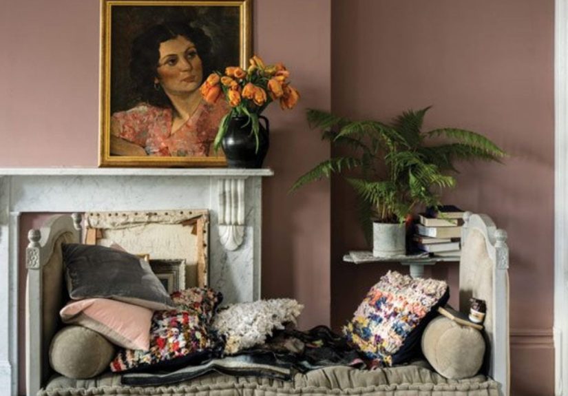
4. Pink-beige or mauve-beige neutrals
These colors often try to pass as warm neutrals, but they can make a home look off in a hurry. A beige with pink undertones may clash with wood tones, stone surfaces, black accents, or cooler fabrics. Instead of reading elegant, it can read powdery, dated, or oddly flushed.
In some lighting, especially artificial evening light, pink-beige walls can make the entire room feel dim and stale. That is not the ambiance most homeowners are chasing unless the design brief was “old lipstick compact.”
Better idea: Use a true warm neutral, mushroom, taupe, or greige that has clearer depth and less cosmetic undertone.
5. Dingy yellow
Yellow can be cheerful, sunny, and charming. It can also look like a highlighter had a rough year. The wrong yellow, especially a muted or dirty yellow, can make walls appear stained and amplify any shadow, smudge, or uneven patch of light. In kitchens, hallways, and bathrooms, it can feel visually grimy faster than many other hues.
Yellow is one of those colors that needs either confidence or restraint. A half-hearted yellow with brownish undertones often feels dated and heavy rather than happy.
Better idea: If you want warmth, consider a creamy off-white, a soft clay, or a pale sand tone that feels grounded without looking stained.
6. Overly dark colors in low-light rooms
Deep paint colors can be stunning. But in a poorly lit room, the wrong dark brown, black, olive, or maroon can make the space feel cave-like and grimy rather than dramatic. This is especially true when the room already has minimal natural light, low ceilings, or bulky furniture.
Dark colors are not automatically dirty-looking. The issue is mismatch. If the space lacks contrast, reflective surfaces, and adequate lighting, a dark wall color can absorb light so aggressively that everything feels heavy and dusty.
Better idea: If you love moody shades, use them with enough lighting, crisp trim, layered textures, and some visual relief. Moody is fabulous. Murky is not.
7. Overly saturated bright colors used everywhere
Ultra-bright red, lime, electric blue, and intense orange can make a room feel chaotic fast, but they can also make it look visually dirty because they magnify contrast, shadow, and clutter. Instead of crisp energy, you get a room that feels loud, crowded, and harder to keep looking clean.
These shades also tend to fight with everyday objects. Toys, cords, books, baskets, mail, and shoes somehow look messier against a hyper-saturated backdrop.
Better idea: Use strong color as an accent, on built-ins, or in small doses. Let the walls support the room instead of trying to win every argument.
Rooms Where Dirty-Looking Paint Shows Up Fastest
Bathrooms
Bathrooms expose weak paint choices immediately. Muddy neutrals, dingy creams, and badly chosen dark shades can make a bathroom feel damp even when it is spotless. Since these rooms often have reflective surfaces, artificial lighting, and limited square footage, every undertone gets louder.
Kitchens
Kitchens are hardworking spaces. Paint colors that lean yellow, brownish beige, or murky gray can combine with cabinets, counters, and shadows to make the room feel greasy-looking. This is particularly risky if the backsplash, flooring, and wall color are all warm but not coordinated.
Hallways
Hallways are where paint colors go to reveal their worst tendencies. They are usually narrow, darker, and full of interrupted light. Any color with a muddy base can make the area look tired and cramped.
Basements
Basements often need colors with warmth and enough light reflectance to prevent them from feeling dull. A gray that looks polished upstairs can look lifeless downstairs. A beige that seemed cozy can turn cardboard-adjacent. Choose carefully.
How to Avoid Paint Colors That Make a Home Look Dirty
Test large swatches, not tiny chips
A one-inch paint chip is a liar with excellent posture. Paint a generous sample on several walls and look at it in morning, afternoon, and evening light.
Check the undertone against fixed finishes
Look at the paint beside flooring, countertops, tile, stone, cabinets, and trim. These elements do not care about your vision board. They will expose an incompatible undertone immediately.
Pay attention to room direction
North-facing rooms usually feel cooler and darker. South-facing rooms bring stronger natural light. East and west exposures shift throughout the day. The same color can look fresh in one room and dingy in another.
Use the right sheen
In living rooms and bedrooms, matte or eggshell can soften the look and hide flaws. In high-moisture or higher-touch areas, the wrong sheen can make smudges more obvious or texture more distracting. Pick finish as carefully as color.
Create contrast on purpose
If your wall color is warm, make sure the trim and surrounding finishes support it. If your flooring is rich and golden, do not blindly grab a gray that may turn green. A little contrast creates freshness. Too little creates mud.
What to Choose Instead for a Cleaner-Looking Home
If your goal is a home that feels clean, polished, and easy on the eyes, the safest categories are:
- Balanced whites that are neither too icy nor too yellow
- Clean greiges with stable undertones
- Soft taupes and mushroom shades with depth
- Muted greens and blues that feel intentional, not dusty
- Warm neutrals with enough light reflectance for the room
The secret is not choosing the “perfect” trendy color. It is choosing the color that behaves well in your actual house. Glamorous concept, I know.
Final Thoughts
Paint colors that make your home look dirty are rarely bad because they are ugly in isolation. They go wrong because they are mismatched to the light, the undertones, the finishes, or the fixed materials already in the space. A creamy white can look elegant in one room and stained in another. A gray can feel timeless or accidentally swampy. A beige can feel warm or like someone diluted peanut butter and committed to it.
The good news is that this problem is fixable. When you test samples properly, study undertones honestly, and choose colors based on your room instead of a fantasy showroom, your home starts looking cleaner immediately. Not because you scrubbed harder, but because the color finally stopped working against you.
And that, frankly, is the kind of low-effort luxury we all deserve.
Real-World Experiences With Paint Colors That Make a Home Look Dirty
One of the most common experiences homeowners talk about is the heartbreak of the “almost white” wall. It starts innocently enough. You pick a creamy white because the sample looks warm and welcoming. You imagine soft sunlight, cozy furniture, and a room that feels expensive without trying too hard. Then the paint goes up, the trim stays a brighter white, and suddenly the walls look yellowed. Not cozy. Not elegant. Just suspiciously old. People often describe this moment the same way: the room is clean, but it no longer looks clean.
Gray creates a different kind of regret. Many homeowners choose gray because it feels safe and versatile, especially after seeing it in magazines, listings, and designer portfolios. But once the color hits a north-facing room or a hallway with poor light, it can shift in unexpected ways. What was supposed to look soft and modern starts leaning green, blue, or brown. The room feels colder, flatter, and somehow dustier, even if everything in it is brand new. This is often the point when people start replacing light bulbs, rugs, and throw pillows, only to realize the real issue is still the wall color.
Another frequent experience happens with beige. People choose beige to make a room feel warm and neutral, but some versions have a muddy cast that drains the life out of the entire space. If the flooring is already warm, the beige can blur into it and create a low-contrast haze. Instead of layered and calm, the room looks like it has been wrapped in a thin coating of toast crumbs. Homeowners often say these rooms feel darker than before, even when the new paint itself is technically lighter than the old color.
Kitchens and bathrooms are where disappointment usually arrives the fastest. A yellow-toned white can make a bathroom feel dim and slightly stale under artificial light. A murky greige in a kitchen can clash with cabinets or countertops and create a look that feels greasy by association. Even when surfaces are spotless, the eye reads the room as less fresh. That is the real frustration: dirty-looking paint makes people feel as though they are losing a battle with cleanliness that is actually a battle with undertones.
On the positive side, many people notice a dramatic improvement the moment they repaint with a better-balanced color. A cleaner white can make trim look sharper, countertops look more expensive, and natural light feel brighter. A better greige can calm a room without swallowing it. A soft taupe or mushroom shade can add warmth without the dingy effect of muddy beige. The experience is often surprisingly emotional. People do not just say the room looks better. They say it feels easier to live in.
That is why paint choice matters so much. It is not only about trend or personal taste. It is about whether the room feels fresh, intentional, and well cared for every single day. The right color makes the whole house seem cleaner. The wrong one makes you side-eye your walls while holding a perfectly good microfiber cloth.