Table of Contents >> Show >> Hide
- What are interactive user guides?
- Why interactive user guides matter
- How interactive user guides differ from traditional documentation
- Core elements of interactive user guides
- What makes an interactive user guide effective?
- Examples of interactive user guides in practice
- Best practices for creating interactive user guides
- Common mistakes to avoid
- When should companies use interactive user guides?
- Experiences with interactive user guides in the real world
- Conclusion
Open almost any modern SaaS product and you will meet them within minutes. A tooltip points to a button you have never clicked before. A checklist nudges you to finish setup. A walkthrough appears just when you are about to get lost and says, in the nicest possible way, “Hey, I’ve got you.” Those little in-app moments are not random decoration. They are part of a bigger product education system known as interactive user guides.
In plain English, interactive user guides are on-screen, in-product experiences that help users learn by doing. Instead of forcing people to leave the app, hunt through a bulky help center, or sit through a tutorial that feels longer than a movie trailer, interactive guides teach users right where the work happens. That is why they have become such a core part of user onboarding, feature adoption, product engagement, and long-term retention.
This matters because modern software is powerful, but power often comes with complexity. Even a well-designed product can overwhelm first-time users if too many options appear at once. Interactive user guides reduce that friction. They break learning into smaller steps, deliver help in context, and turn product education into something closer to a conversation than a lecture.
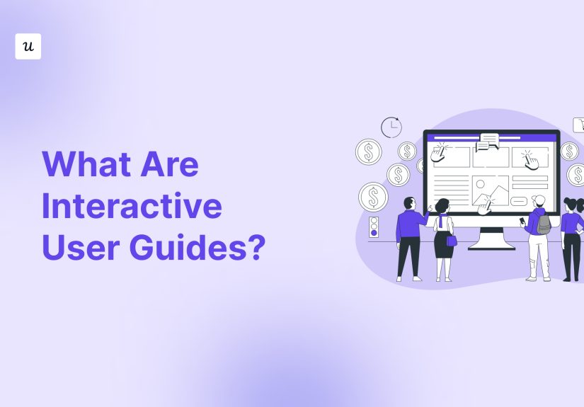
What are interactive user guides?
Interactive user guides are in-app guidance elements that teach people how to use a product through action, not just explanation. They usually combine UI patterns such as tooltips, hotspots, modals, onboarding checklists, walkthroughs, banners, and embedded resource centers. Their goal is simple: help users understand what to do next and why it matters.
The word interactive is the important part. A traditional user guide might explain a process in a PDF or a help article. An interactive guide meets users inside the product and responds to their behavior. It can appear when someone signs up, when they visit a feature for the first time, when they hesitate on a step, or when a team launches a new workflow. In other words, it is less “read this manual” and more “let me show you while you’re already here.”
That is why interactive user guides are often associated with contextual help. The best guide shows the right instruction to the right person at the right moment. A new user may need a welcome flow. A power user may need a subtle tooltip announcing an advanced feature. An administrator may need setup guidance that regular users should never even see. Good guidance respects role, timing, intent, and attention span.
Why interactive user guides matter
Software teams do not create interactive guides just because tooltips are cute. They do it because users rarely fall in love with a product they do not understand. The gap between signing up and reaching the first meaningful success is where many users disappear. Interactive user guides shrink that gap.
They reduce time-to-value
When users can complete a key task quickly, they understand the product’s value sooner. That first win might be creating a report, inviting teammates, publishing a landing page, or automating a workflow. Interactive guides move users toward that “aha” moment without burying them in unnecessary detail.
They lower friction and confusion
Even intuitive interfaces have moments of uncertainty. A guide can explain a tricky step, define an icon, or point out where to click next. That keeps users in flow instead of sending them into a support spiral that begins with “I swear the button was here a second ago.”
They improve feature discovery
Many products have valuable features users never find on their own. Interactive guidance can highlight new tools, recommend next-best actions, and reveal advanced functionality gradually. This helps teams increase feature adoption without resorting to giant announcement blasts that nobody reads.
They support retention and expansion
When people use a product successfully, they are more likely to stay. When they discover more relevant features, they are more likely to deepen usage. For subscription businesses, that makes interactive user guides more than a nice UX touch. They become part of the growth engine.
How interactive user guides differ from traditional documentation
Traditional documentation still matters. Help centers, knowledge bases, setup manuals, and training materials are essential for deeper learning and troubleshooting. But interactive guides solve a different problem.
Traditional docs are usually destination content. Users must decide to leave what they are doing and search for help. Interactive guides are situational content. They appear inside the product, often in response to a specific behavior or stage in the customer journey.
Think of it this way:
- A help article says, “Here are the eight steps to create your first dashboard.”
- An interactive guide says, “Click here first. Nice. Now choose this filter. Perfect. You’re almost there.”
Neither format replaces the other. The smartest products use both. Interactive user guides handle action-oriented, moment-of-need learning. Documentation handles depth, reference, and edge cases. One is the coach on the field. The other is the playbook on the bench.
Core elements of interactive user guides
Tooltips
Tooltips are brief messages attached to a UI element. They explain, clarify, or direct attention. A good tooltip is short, useful, and timely. It should not read like a mini novel squeezed into a speech bubble. If users need three scrolls to finish reading it, it is no longer a tooltip. It is a hostage situation.
Hotspots and beacons
These are small visual cues that draw attention to a feature or area of the interface. They are useful for feature discovery and low-pressure guidance because they invite exploration rather than forcing it.
Walkthroughs and product tours
These multi-step flows guide users through a workflow, such as setting up an account, creating a project, or importing data. The best product tours are short, goal-based, and interactive. They do not simply parade users around the UI like a museum audio guide. They help users complete something meaningful.
Onboarding checklists
Checklists break activation into visible tasks. They work well because they turn a vague goal like “get started” into concrete actions. Users know what to do, what is left, and what success looks like. A checklist can be surprisingly motivating, especially when each item corresponds to real progress.
Modals, slideouts, and banners
These larger patterns are useful for announcements, major onboarding moments, or setting expectations. Because they interrupt the interface more than a tooltip does, they should be used carefully. A modal should feel important, not like a pop-up that barged in uninvited and took over the living room.
Resource centers and self-serve help widgets
Some interactive guides live on demand rather than appearing automatically. Embedded resource centers let users find tutorials, FAQs, videos, and walkthroughs without leaving the product. This is ideal for self-serve support and continued learning.
What makes an interactive user guide effective?
It is contextual
The most effective guidance appears when it is relevant. Showing advanced admin instructions to a first-time end user is not helpful. Neither is triggering a welcome tour on the tenth login. Great guidance is targeted by persona, lifecycle stage, role, behavior, and sometimes even plan type.
It is goal-oriented
Users do not log in because they want to admire your sidebar. They log in to finish a task. Interactive guides should therefore focus on outcomes: publish the page, connect the integration, invite the team, automate the report. When a guide helps users achieve a real job-to-be-done, it feels useful instead of promotional.
It is concise
In-app guidance works best in small doses. Long blocks of text slow people down and overload memory. Microcopy should be clear, direct, and easy to scan. Say what the element does, why it matters, and what to do next. Then get out of the way.
It is interactive
The guide should encourage action. Ask the user to click, type, select, or complete a task. Passive tours are easy to dismiss and easier to forget. Guided action builds confidence faster than passive explanation.
It is measurable
If teams cannot measure whether the guide works, they are basically decorating the UI with optimism. Effective interactive user guides are connected to analytics. Teams monitor completion rates, drop-off points, activation events, feature adoption, support deflection, and downstream retention.
Examples of interactive user guides in practice
Imagine a project management platform. A new user signs up and lands on an onboarding screen that asks a few simple questions: team size, use case, and main goal. Based on those answers, the product launches a personalized checklist: create your first project, invite two teammates, and build one task board. Each step opens a contextual walkthrough inside the app. That entire setup is an interactive user guide system.
Now imagine a CRM tool launching a new automation feature. Instead of sending one giant email that begins with “We’re excited to announce…,” the team places a hotspot near the automation tab. When eligible users click it, a short tooltip explains the feature benefit. A walkthrough then guides them through building their first automation. That is also an interactive guide.
Or picture an internal HR portal for employees. During benefits enrollment season, a slideout appears only for users who have not completed enrollment. It explains the deadline, links to an embedded checklist, and offers on-demand help articles within a resource center. That is interactive guidance used beyond customer SaaS, in a digital workplace context.
Best practices for creating interactive user guides
Start with one key success path
Do not try to teach the whole product at once. Identify the few actions most strongly linked to user success and guide those first. For many products, that means setup, initial configuration, first project creation, first import, or first collaboration action.
Segment your users
Beginners, power users, admins, and trial users should not see the same guidance. Personalization improves relevance and reduces annoyance. The right guide feels like support. The wrong guide feels like spam wearing a UX costume.
Use progressive disclosure
Reveal complexity over time. Start with basics, then introduce deeper capabilities as users become more confident. This helps reduce cognitive load and prevents that classic product sin: showing seventeen features before the user has done one useful thing.
Write like a human
Microcopy should be friendly and clear. Avoid jargon unless your audience genuinely uses it. “Create your first dashboard” beats “Initialize data visualization assets” every single day of the week.
Test and iterate
Interactive user guides are not set-and-forget assets. Products change, workflows evolve, and user behavior reveals surprises. Review analytics, collect feedback, and keep refining the flow. Sometimes the problem is not the feature. It is the guide explaining it badly.
Common mistakes to avoid
- Overloading the screen: Too many modals, hotspots, and prompts at once can make the product feel noisy.
- Creating passive tours: A slideshow about the interface is usually less effective than a task-based walkthrough.
- Ignoring timing: Help shown too early or too late often gets dismissed.
- Skipping analytics: Without measurement, teams cannot tell whether guidance improves onboarding or just exists.
- Forgetting experienced users: Existing customers also need contextual guidance when features change or new workflows launch.
When should companies use interactive user guides?
The short answer: almost anytime a user needs help completing an action inside software. They are especially valuable for SaaS onboarding, free trial conversion, enterprise software adoption, employee training, new feature launches, self-serve support, and workflow changes after redesigns.
They are most useful when the product has a learning curve, when multiple user roles exist, or when adoption depends on users completing a sequence of actions correctly. Simple products may only need lightweight tooltips and a resource center. More complex platforms often benefit from layered guidance across onboarding, feature discovery, and support.
Experiences with interactive user guides in the real world
In practice, the experience of interactive user guides is usually defined by one big question: do they feel helpful or do they feel bossy? Users rarely complain about guidance that gets them unstuck. They complain about guidance that interrupts them, repeats itself, or explains obvious things as if they have never used a computer before. That is why the best experiences tend to feel almost invisible. The guide appears at the exact moment of hesitation, offers a small nudge, and disappears as soon as the user regains momentum.
For new users, a strong interactive guide can create an immediate sense of relief. Instead of facing a blank dashboard and wondering where to begin, they get a clear starting point. A checklist gives structure. A walkthrough reduces uncertainty. A tooltip clarifies unfamiliar language. That combination can transform the emotional tone of the first session. The product feels less intimidating, more learnable, and far more trustworthy.
For product teams, the experience is slightly different. They often discover that interactive user guides are not just content assets but design decisions. A guide that constantly explains the same confusing step may reveal a UX problem underneath. In that sense, guides can act like diagnostic tools. If users need six prompts to complete a basic action, the product might need simplification, not just more coaching bubbles.
Customer success and support teams also tend to notice the difference when interactive guides are done well. Repetitive “How do I do this?” questions start dropping. Customers become more self-sufficient. Feature launches become smoother because teams can educate users in the product rather than relying only on webinars, PDFs, and email announcements. The support burden does not disappear, of course, but it often becomes more strategic and less repetitive.
There is also a maturity curve. Early-stage companies often begin with a welcome modal and a few tooltips. As the product grows, they add segmentation, more advanced walkthroughs, and behavior-based triggers. Later, they connect the entire system to product analytics, experimentation, and feedback loops. At that stage, interactive user guides stop being a nice add-on and become part of a broader digital adoption strategy.
One of the most interesting real-world lessons is that users often prefer guidance that respects their autonomy. Optional help, dismissible prompts, and on-demand resource centers usually feel better than forced, linear tours. People want support, but they also want control. The best interactive user guides understand that balance. They guide without nagging, teach without lecturing, and assist without turning the interface into a carnival of pop-ups.
So the real experience of interactive user guides is not about flashy UI patterns. It is about confidence. When users feel confident, they move faster, explore more, and trust the product sooner. That confidence is the real job of a great guide. Everything else is just the speech bubble.
Conclusion
Interactive user guides are not simply digital manuals dressed up in brighter colors. They are contextual, in-app teaching tools that help people learn software by doing. When designed well, they reduce friction, improve onboarding, accelerate time-to-value, support feature discovery, and contribute to stronger product adoption over time.
The strongest interactive guides are short, relevant, measurable, and tied to real user goals. They do not overwhelm people with every feature at once. They guide the next best action, build confidence step by step, and support users throughout the journey, not just during signup. In a world where software is increasingly powerful and increasingly complex, that kind of guidance is no longer a nice extra. It is part of the product experience itself.